Untangling complexity: harnessing PCA for data dimensionality reduction
Principal Component Analysis (PCA) is a statistical technique used in data analysis to simplify the dimensionality of high-dimensional datasets. PCA finds a new set of dimensions (or principal components, PC) that capture the most important variance in the data. In this tutorial, we discus the theoretical basis and practical application of PCA by applying PCA to examples in Python.
The mathematics behind PCA
In the following, I briefly describe the mathematical basis of PCA. If you are not interested in the maths, you can skip this section and jump directly to the Python example below.
Principal Component Analysis (PCA) is a statistical procedure that transforms a set of observations of possibly correlated variables into a set of values of linearly uncorrelated variables called principal components (PC). These principal components are ordered by the amount of original variance they capture, with the first principal component accounting for the largest possible variance. The process allows a multi-dimensional dataset to be distilled into fewer dimensions, thus reducing its complexity while retaining as much original information as possible. The following five steps describe the mathematical basis of this process.
1. Data standardization
Let $x$ be a vector containing the data for a specific “feature”, i.e., an independent variable, e.g., a measurement during an experiment. The number of these features determines the number of dimensions in the high-dimensional dataset. In order to avoid bias due to the scales of the different features, we first standardize each data vector. This process adjusts the values so that they have a mean of zero and standard deviation of one, also known as z-scoring:
\[{\hat{x}_i = \frac{x_i - \mu_x}{\sigma_x}}\] where $x_i$ is a single data point, $\mu_x$ is the mean of the data, and $\sigma_x$ is the standard deviation.
2. Calculate the covariance matrix
The covariance matrix $C_{ij}$ is a square matrix that describes the covariance between each pair of features in the data. The $(i, j)$ entry in the covariance matrix is the covariance between the $i$-th and $j$-th feature:
\[C_{ij} = \frac{1}{n-1} \sum_{k=1}^n (\hat{x}_{k,i} - \mu_{i})(\hat{x}_{k,j} - \mu_{j})\]where \(\hat{x}_{k,i}\) and $\hat{x}_{k,j}$ are individual (normalized) data points of feature $i$ and $j$, respectively, and $\mu_i$ and $\mu_j$ are the corresponding means of these features. $n$ is the number of available data points.
3. Determine eigenvalues and eigenvectors
Once the covariance matrix is calculated, we determine its eigenvalues and corresponding eigenvectors. The eigenvalues represent the variance magnitude along the direction of their associated eigenvectors.
Given a square matrix $A$, an eigenvector $v$ and its corresponding eigenvalue $\lambda$ satisfy the following equation:
\[A v = \lambda v\]In our case, we have:
\[C v = \lambda v\]The eigenvalues $\lambda$ can be computed by solving the characteristic equation:
\[\operatorname{det}(C−\lambda I)=0\]where $I$ is the identity matrix of the same dimensions as $C$, $\operatorname{det}(C−\lambda I)$ refers to the determinant of the matrix resulting from $C−\lambda I$. Solving this equation gives us the eigenvalues $\lambda$.
Once the eigenvalues $\lambda$ are found, they are substituted back into the equation $C v = \lambda v$ to solve for the corresponding eigenvectors $v$. This is essentially solving a system of linear equations, which can be done using techniques such as Gaussian elimination. Each eigenvector $v$ is then normalized (i.e., scaled to have length or magnitude one).
Usually, these calculations are handled by numerical libraries such a NumPy, since they can become computationally intensive for large matrices.
4. Select principal components
The eigenvectors of the covariance matrix represent the directions of the maximum variance in the data, and the associated eigenvalues represent the magnitude of this variance. The principal components (PC) are selected based on their corresponding eigenvalues. The first PC is the eigenvector associated with the largest eigenvalue, the second PC is associated with the second largest eigenvalue, and so on.
5. Data projection
After the principal components are selected, the next step is to project the original data along these components. This can be achieved by multiplying the standardized data matrix by the principal components. If $\hat{X}$ is our standardized data matrix and $P$ is the matrix of selected principal components, the projected data $D$ can be calculated as:
\[D=\hat{X}P\]$D$ is our new dataset with reduced dimensions, which can be used for further analysis and interpretation of our data.
Performing a PCA in Python
Before we dive into a more comprehensive example, let’s first look at how to basically perform the steps described above in Python, just using the NumPy library.
Let’s generate some random two-dimensional data, i.e., a dataset with two features:
import numpy as np
import matplotlib.pyplot as plt

# generate random two-dimensional data:
np.random.seed(1)
mean = [0, 0]
cov = [[1.5, 0.75], [0.75, 1.5]]
X = np.random.multivariate_normal(mean, cov, 100)

# visualization of the data:
plt.figure(figsize=(6, 6))
plt.scatter(X[:, 0], X[:, 1])
plt.title('Original Data')
plt.xlabel('Feature 1')
plt.ylabel('Feature 2')
plt.xticks(np.arange(-2,2.1,1))
plt.yticks(np.arange(-2,2.1,1))
plt.grid(True)
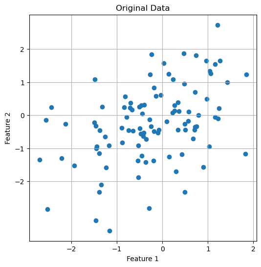 Original dataset with two features.
First, we standardize the data:
# centering the data:
X_centered = X - np.mean(X, axis=0)

# scaling of the data:
X_scaled = X_centered / np.std(X_centered, axis=0)
Next, we calculate the covariance matrix:
# calculate of the covariance matrix:
cov_matrix = np.cov(X_scaled.T)
Then, we determine the eigenvalues and eigenvectors of the covariance matrix and sort the eigenvectors in descending order:
# calculation of the eigenvalues and eigenvectors:
eigenvalues, eigenvectors = np.linalg.eig(cov_matrix)

# sorting the eigenvectors according to descending eigenvalues:
sorted_indices = np.argsort(eigenvalues)[::-1]
eigenvalues = eigenvalues[sorted_indices]
eigenvectors = eigenvectors[:, sorted_indices]
The sorted eigenvectors represent the principal components of our data.
Finally, we project the data onto the principal components and visualize the result. We select the first two principal components:
# projecting the data onto the principal components:
projected_data = np.dot(X_scaled, eigenvectors[:, :2])

# visualization of the main components in the original space of data:
plt.figure(figsize=(6, 6))
plt.scatter(X[:, 0], X[:, 1])
plt.quiver(np.mean(X[:, 0]), np.mean(X[:, 1]), eigenvectors[0, 0], eigenvectors[1, 0],
           color='red', scale=2, label='Principal Component 1')
plt.quiver(np.mean(X[:, 0]), np.mean(X[:, 1]), eigenvectors[0, 1], eigenvectors[1, 1],
           color='blue', scale=3, label='Principal Component 2')
plt.title('Principal Components in Original Data Space')
plt.xlabel('Feature 1')
plt.ylabel('Feature 2')
plt.legend()
plt.grid(True)
plt.show()

# visualization of the data on the first two main components:
plt.figure(figsize=(6, 6))
plt.scatter(projected_data[:, 0], projected_data[:, 1])
plt.title('Data Projected onto First Two Principal Components')
plt.xlabel('Principal Component 1')
plt.ylabel('Principal Component 2')
plt.grid(True)
plt.show()
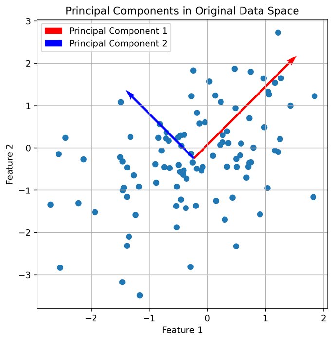
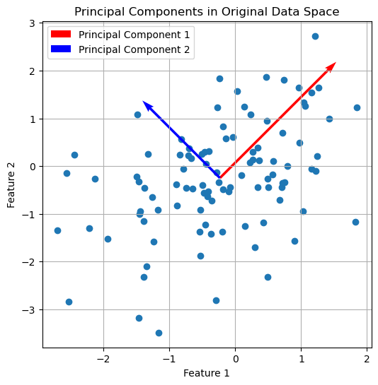 The first two principal components plotted into the original data space.
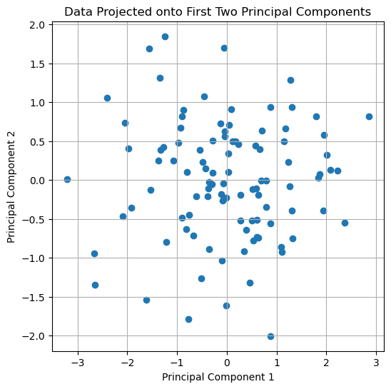 The original dataset projected onto the first two principal components.
This example depicts the basic steps of PCA. In fact, a dimensionality reduction from two dimension to two dimension is not very useful. In the following example, we will see how PCA can be used to reduce the dimensionality of a dataset from 13 to 3 dimensions while preserving most of the information in the data. For convenience, we will use the PCA class from the scikit-learn library instead of calculating the covariance matrix and the eigenvectors manually.
Applying PCA to a high-dimensional dataset
We now apply PCA to the high-dimensional “Wine” datasetꜛ from the sklearn-datasets library. The dataset contains 178 samples of wine, each with 13 features. The features are the results of a chemical analysis of wines grown in the same region in Italy, but derived from three different cultivars.
Let’s take a look at the dataset:
import numpy as np
import pandas as pd
import matplotlib.pyplot as plt
import seaborn as sns
import pingouin as pg
from sklearn.datasets import load_wine
from sklearn.preprocessing import StandardScaler
from sklearn.decomposition import PCA
from sklearn.cluster import DBSCAN, KMeans

# load the wine dataset:
input_data = load_wine()
X = input_data.data

# normalize the data (z-score standardization):
X_Factor = StandardScaler().fit_transform(X)
df = pd.DataFrame(data=X_Factor, columns=input_data.feature_names)

df_full = df.copy()
df_full['Target'] = input_data.target
target_names = input_data.target_names
As mentioned before, the Wine dataset consists of 13 features and three assigned classes, i.e., labels (here: wine classes (“Targets”) 0, 1, and 2):
We could now look at each of the 13 features individually and try to make any inferences on them or from combinations of them, e.g., by plotting the paired relationships between the individual features:
# scatter plot of the features
sns.set(style="ticks")
sns.pairplot(df_full, hue='Target', markers='o', 's', 'D', palette="viridis")
plt.suptitle('Pairwise relationships in the (high-dimensional) Wine dataset.', y=1.02)
plt.show()
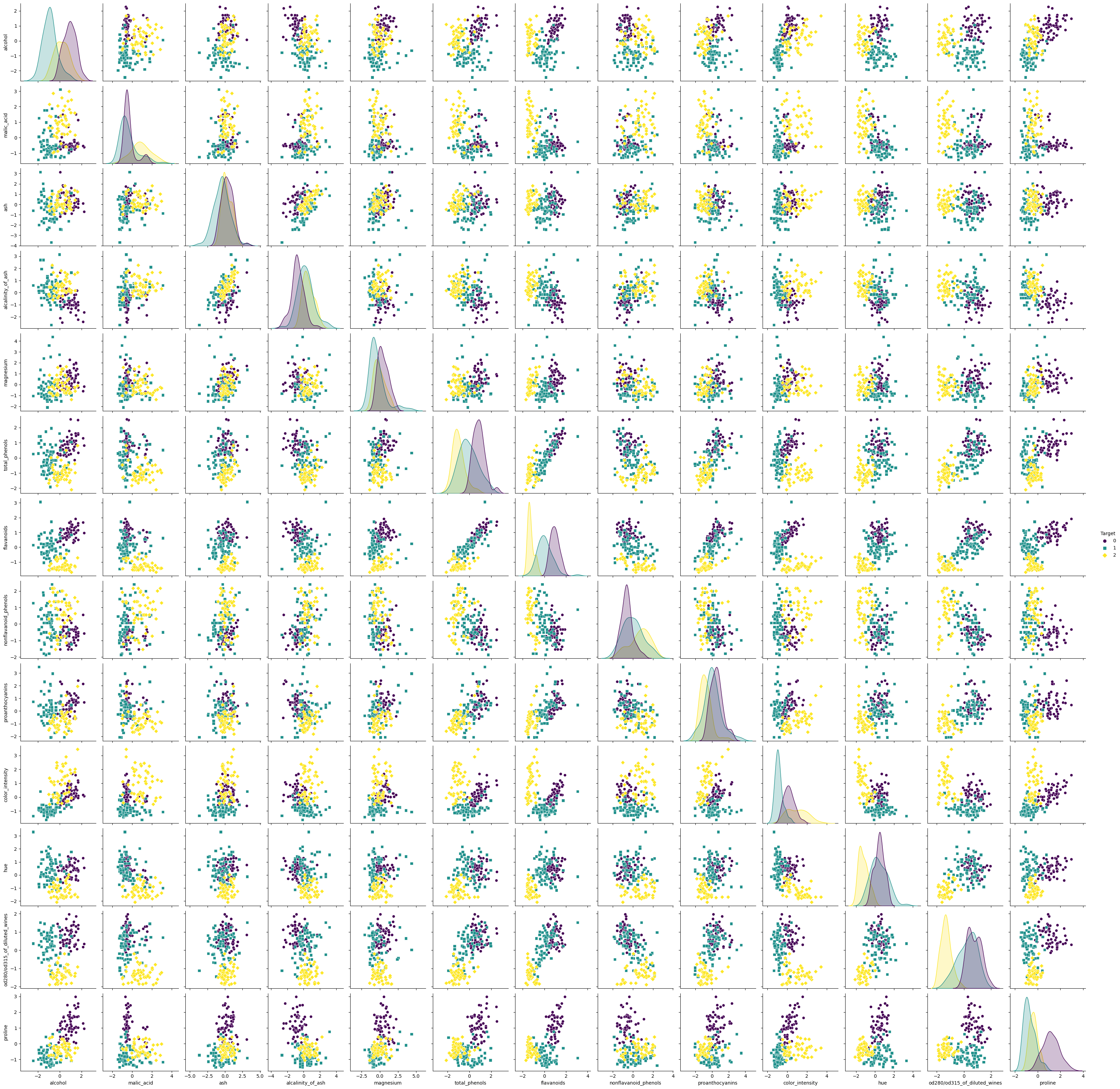 Pairwise relationships in the high-dimensional Wine dataset.
However, it is very difficult to derive conclusions from the abundance of all possible combinations and dependencies of the 13 features. Therefore, this dataset is an ideal candidate for dimensionality reduction using PCA.
Estimating the number of relevant PCs
First, we estimate the number of relevant principal components by calculating a PCA with as many principal components as features present, and then we plot the corresponding singular values of the PCA in a so-called scree plot:
# Explore the number of necessary PCA:
pca_explore = PCA(n_components=13)
pcas_explore = pca_explore.fit_transform(X_Factor)
ev = pca_explore.singular_values_
# Scree plot for validating the number of pcs:
plt.figure(figsize=(5, 3))
plt.scatter(range(1, df.shape1+1), ev)
plt.plot(range(1, df.shape1+1), ev)
plt.title('Scree Plot')
plt.xlabel('PC#')
plt.ylabel('Singular Value')
plt.ylim(0, 30)
plt.grid()
plt.show()
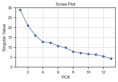 Scree plot for validating the number of relevant principal components
To estimate the number of relevant PCs from the scree plot, we can look at where the “elbow” is, i.e., the point where the curve starts to flatten out. In our case, it is around PC 3, so we can assume that the first three PCs are the most relevant ones as they carry the majority of the variance.
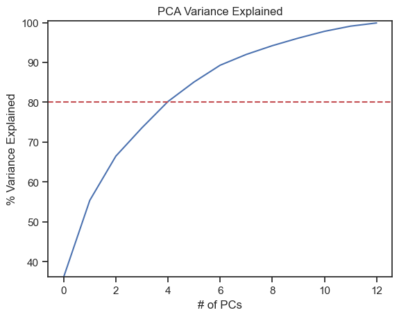
We can alternatively use another method to estimate the relevant PCs. This method determines the number of relevant PCs by calculating the so-called explained variances, i.e., the cumulative ratio of the eigenvalues to the sum of eigenvalues. Also this method shows us, how much variance (and thus information) can be explained by each PC. This is important as we lose some variance when transforming from high-dimensional to low-dimensional space. As a rule of thumb, a cumulative explained variance of 80% is often chosen as minimum limit:
var=np.cumsum(np.round(pca_explore.explained_variance_ratio_, decimals=3) *100)
plt.plot(var)
plt.ylabel("% Variance Explained")
plt.xlabel("# of PCs")
plt.title ("PCA Variance Explained")
plt.ylim(min(var), 100.5)
plt.axhline(y=80, color='r', linestyle='--')
plt.show()

print(f"Explained variances for all 13 PCs:\n {pca_explore.explained_variance_ratio_}\n")
print(f"Cumulative explained variance for the first 3 PCs: {np.sum(pca_explore.explained_variance_ratio_[0:3])}")
Explained variances for all 13 PCs:
[0.36198848 0.1920749  0.11123631 0.0706903  0.06563294 0.04935823
 0.04238679 0.02680749 0.02222153 0.01930019 0.01736836 0.01298233
 0.00795215]

Cumulative explained variance for the first 3 PCs:
0.6652996889318527
Through the explained variance we can see that the first principal component contains 36%, the second 19% and the third 11% of the total variance of the dataset. Together, the first three components contain 67% of the information, which, by the way, is not all that good. A PCA with 4 components would probably be advisable. However, to keep our example illustrative, we settle on $n=3$ components.
Carrying out the PCA
Now, we carry out the PCA with $n=3$ components, using the PCA class from sklearn.decomposition module:
# carrying out the PCA:
pca = PCA(n_components=3)
pcas = pca.fit_transform(X_Factor)

# create a DataFrame for the first (three) principle components:
principal_df = pd.DataFrame(data=pcas, columns=['PC1', 'PC2', 'PC3'])
final_df = pd.concat([principal_df,
                     pd.DataFrame(data=input_data.target,
                     columns=['target'])], axis=1)

# visualize the PCA results:
colors = ['r', 'g', 'b']
fig = plt.figure()
ax = fig.add_subplot(111, projection='3d')
for target, color in zip(target_names, colors):
    indices = input_data.target == input_data.target_names.tolist().index(target)
    ax.scatter(pcas[indices, 0], pcas[indices, 1], pcas[indices, 2], c=color, label=target)
ax.view_init(elev=35, azim=45)
ax.set_xlabel('PC1')
ax.set_ylabel('PC2')
ax.set_zlabel('PC3', rotation=90)
ax.zaxis.labelpad=-4.9
ax.set_title('PCA of Wine Dataset')
ax.legend()
plt.show()

fig, axs = plt.subplots(1, 3, figsize=(12, 4))
# "XY" projection:
for target, color in zip(target_names, colors):
    indices = input_data.target == input_data.target_names.tolist().index(target)
    axs[0].scatter(pcas[indices, 0], pcas[indices, 1], c=color, label=target)
axs[0].set_xlabel('PCA 1')
axs[0].set_ylabel('PCA 2')
axs[0].set_title('XY Projection')

# "XZ" projection:
for target, color in zip(target_names, colors):
    indices = input_data.target == input_data.target_names.tolist().index(target)
    axs[1].scatter(pcas[indices, 0], pcas[indices, 2], c=color, label=target)
axs[1].set_xlabel('PCA 1')
axs[1].set_ylabel('PCA 3')
axs[1].set_title('XZ Projection')

# "YZ" projection:
for target, color in zip(target_names, colors):
    indices = input_data.target == input_data.target_names.tolist().index(target)
    axs[2].scatter(pcas[indices, 1], pcas[indices, 2], c=color, label=target)
axs[2].set_xlabel('PCA 2')
axs[2].set_ylabel('PCA 3')
axs[2].set_title('YZ Projection')
plt.show()
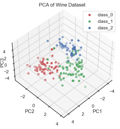 PCA of the wine dataset (3D scatter plot).
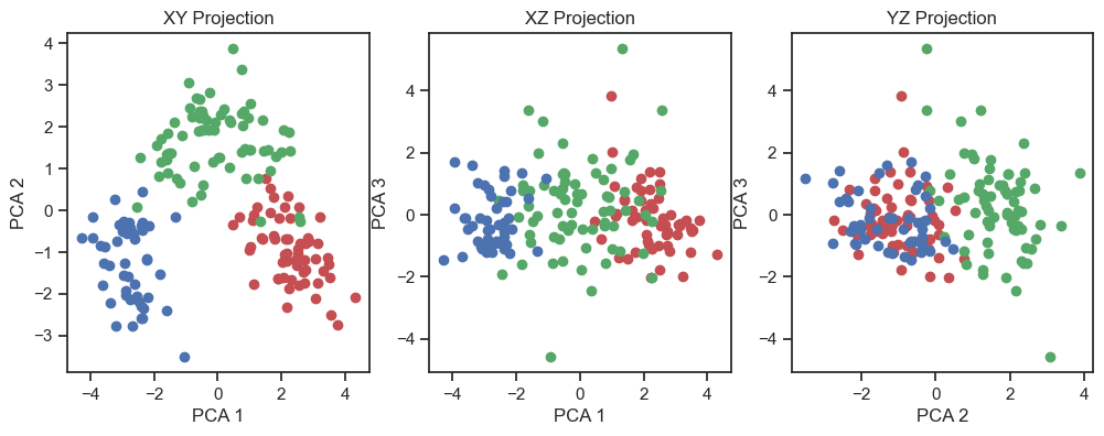 PCA of the wine dataset (2D projections).
By visualizing the projections of the data onto the first three principal components, a distinct structure within the dataset becomes apparent. In fact, we can distinguish the three wine classes and we would be able to reconstruct them “blindly”, i.e. from the PCA alone. This is a good sign that the PCA represents the data well.
Verification of the correspondence of the PCs with the real classes
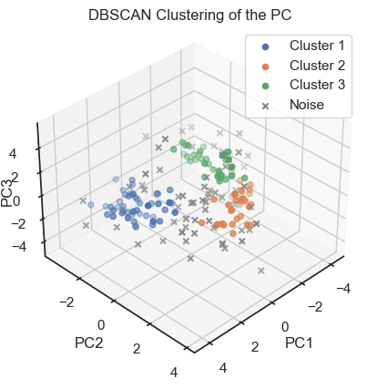
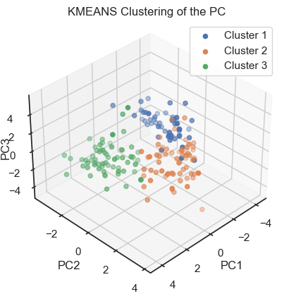
To verify that we can indeed re-identify the three wine classes within the reduced dataset, we cluster the PCs once with DBSCAN and once with Kmeans:
""" Verify reproducibility by "blindly" identifying clusters from the factors (i.e.,
do the blind clusters match with the actual classes?):"""
dbscan = DBSCAN(eps=0.8, min_samples=5)
dbscan_labels = dbscan.fit_predict(pcas)
dbscan_labels_unique = set(dbscan_labels)
fig = plt.figure()
ax = fig.add_subplot(111, projection='3d')
for label in dbscan_labels_unique:
if label ==-1:
cluster_points = pcas[dbscan_labels==label]
ax.scatter(cluster_points[:,0], cluster_points[:,1], cluster_points[:,2], marker="x",
label="Noise", color="grey")
else:
cluster_points = pcas[dbscan_labels==label]
ax.scatter(cluster_points[:,0], cluster_points[:,1], cluster_points[:,2],
label=f"Cluster {label+1}")
ax.view_init(elev=35, azim=45)
ax.set_xlabel('PC1')
ax.set_ylabel('PC2')
ax.set_zlabel('PC3', rotation=90)
ax.zaxis.labelpad=-5.5
ax.set_title('DBSCAN Clustering of the PC')
ax.legend()
plt.show()
fig, axs = plt.subplots(1, 3, figsize=(12, 4)) # Adjust the figure size as needed
# XY projection:
for label in dbscan_labels_unique:
if label ==-1:
cluster_points = pcas[dbscan_labels==label]
axs[0].scatter(cluster_points[:,0], cluster_points[:,1], marker="x",
label="Noise", color="grey")
else:
cluster_points = pcas[dbscan_labels==label]
axs[0].scatter(cluster_points[:,0], cluster_points[:,1],
label=f"[Cluster] {label+1}")
axs[0].set_xlabel('PC1')
axs[0].set_ylabel('PC2')
axs[0].set_title('DBSCAN classes XY Projection')
# XZ projection:
for label in dbscan_labels_unique:
if label ==-1:
cluster_points = pcas[dbscan_labels==label]
axs[1].scatter(cluster_points[:,0], cluster_points[:,2], marker="x",
label="Noise", color="grey")
else:
cluster_points = pcas[dbscan_labels==label]
axs[1].scatter(cluster_points[:,0], cluster_points[:,2],
label=f"[Cluster] {label+1}")
axs[1].set_xlabel('PC1')
axs[1].set_ylabel('PC3')
axs[1].set_title('DBSCAN classes XZ Projection')
# YZ projection:
for label in dbscan_labels_unique:
if label ==-1:
cluster_points = pcas[dbscan_labels==label]
axs[2].scatter(cluster_points[:,1], cluster_points[:,2], marker="x",
label="Noise", color="grey")
else:
cluster_points = pcas[dbscan_labels==label]
axs[2].scatter(cluster_points[:,1], cluster_points[:,2],
label=f"[Cluster] {label+1}")
axs[2].set_xlabel('PC2')
axs[2].set_ylabel('PC3')
axs[2].set_title('DBSCAN classes YZ Projection')
and
kmeans = KMeans(n_clusters=3, random_state=0)
kmeans_labels = kmeans.fit_predict(pcas)
kmeans_labels_unique = set(kmeans_labels)

fig = plt.figure()
ax = fig.add_subplot(111, projection='3d')
for label in kmeans_labels_unique:
    cluster_points = pcas[kmeans_labels==label]
    ax.scatter(cluster_points[:,0], cluster_points[:,1], cluster_points[:,2],
                   label=f"Cluster {label+1}")
ax.view_init(elev=35, azim=45)
ax.set_xlabel('PC1')
ax.set_ylabel('PC2')
ax.set_zlabel('PC3', rotation=90)
ax.zaxis.labelpad=-5.5
ax.set_title('KMEANS Clustering of the PC')
ax.legend()
plt.show()

fig, axs = plt.subplots(1, 3, figsize=(12, 4))
# XY projection:
for label in kmeans_labels_unique:
    cluster_points = pcas[kmeans_labels==label]
    axs[0].scatter(cluster_points[:,0], cluster_points[:,1],
                   label=f"Cluster {label+1}")
axs[0].set_xlabel('PC1')
axs[0].set_ylabel('PC2')
axs[0].set_title('KMEANS classes XY Projection')
# XZ projection:
for label in kmeans_labels_unique:
    cluster_points = pcas[kmeans_labels==label]
    axs[1].scatter(cluster_points[:,0], cluster_points[:,2],
                   label=f"Cluster {label+1}")
axs[1].set_xlabel('PC1')
axs[1].set_ylabel('PC13')
axs[1].set_title('KMEANS classes XZ Projection')
# YZ projection:
for label in kmeans_labels_unique:
    cluster_points = pcas[kmeans_labels==label]
    axs[2].scatter(cluster_points[:,1], cluster_points[:,2],
                   label=f"Cluster {label+1}")
axs[2].set_xlabel('PC2')
axs[2].set_ylabel('PC3')
axs[2].set_title('KMEANS classes YZ Projection')
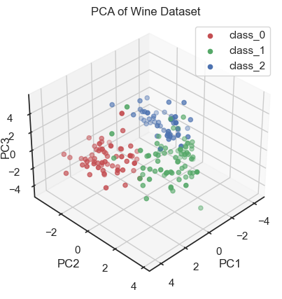
 PCs with color-assignments regarding the original classes (2D projections).
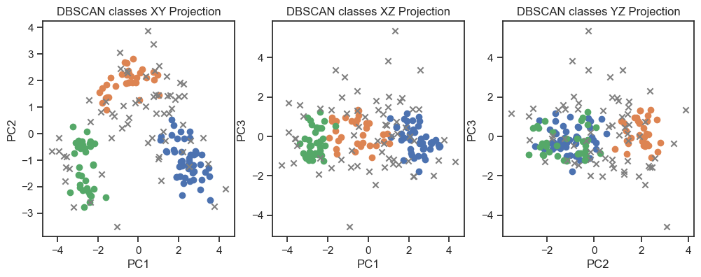 DBSCAN clustering of the PCs. (2D projections).
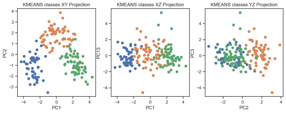 Kmeans clustering of the PCs. (2D projections).
With both cluster methods we would be able to re-identify the three known wine classes in the dataset. Hence, for any future “blind” (=not yet classified) new data, we would be able to make a prediction just using PCA and cluster analysis.
Conclusion
Principal Component Analysis (PCA) is a statistical technique used to simplify high-dimensional datasets by identifying the most important patterns of variation. It achieves this by finding a new set of dimensions, called principal components (PC), that capture the maximum variance in the data. As an illustrative example, we have applied PCA to the sklearn “Wine” dataset. Here, PCA reveals a distinct structure within the dataset, that allows for the identification of the apparent wine classes – in a “blind” (i.e., unsupervised) manner by additionally applying a clustering method.
Overall, PCA proves to be a valuable technique for dimensionality reduction and data visualization. It is a powerful tool for exploratory data analysis and can be used to identify the most important patterns of variation in high-dimensional datasets.
If you have any questions or suggestions, feel free to leave a comment below or reach out to me on Mastodonꜛ. If you want to learn more about PCA, I recommend the following resources:
- PCA on Wikipediaꜛ
- StatQuest YouTube video on PCAꜛ
- PCA on Towards Data Scienceꜛ
- PCA on the sklearn documentationꜛ
- PCA on scikit-learn tutorialsꜛ
- PCA on scikit-learn Iris dataset exampleꜛ
- PCA vs. LDA on scikit-learn examplesꜛ
- PCA on scikit-learn examplesꜛ
- Kernel PCA on scikit-learn examplesꜛ
The entire code used in this post is also available in this GitHub repositoryꜛ.
In the next post we will see, if we can achieve similar results with a different dimensionality reduction technique: Factor Analysis (FA).



comments