Unlocking hidden patterns with Factor Analysis
Factor Analysis (FA) is a statistical method used to explore the potential underlying structure of complex datasets. It attempts to find latent variables, or “factors,” that explain the relationships among observed variables. In this tutorial, we learn how to use FA by applying it to examples in Python.
The mathematics behind Factor Analysis
In the following, I briefly describe the concept of Factor Analysis (FA), listing the main steps of the method.
The main assumption in FA is, that observed variables are linear combinations of potential factors plus some error term, and these factors are orthogonal. This can be represented as
\[X=L\,F+E\]where \(X\) is the matrix of observed variables, \(L\) is the factor loading matrix, which represents the relationship of each variable with the underlying factor, $F$ is the matrix of the factors, and \(E\) is the error term, which includes unique or error variances.
1. Data standardization
Let $x$ be a vector of \(X\) containing the data for a specific “feature”, i.e., an independent variable, e.g., a measurement during an experiment. The number of these features determines the number of dimensions in the high-dimensional dataset. In order to avoid bias due to the scales of the different features, we first standardize each data vector. This process adjusts the values so that they have a mean of zero and standard deviation of one, also known as z-scoring:
\[{\hat{x}_i = \frac{x_i - \mu_x}{\sigma_x}}\] where $x_i$ is a single data point, $\mu_x$ is the mean of the data, and $\sigma_x$ is the standard deviation.
2. Estimate the correlation matrix
Similar to PCA, FA starts with the correlation matrix of observed variables (“features”). This is a square symmetric matrix where the entries are correlations between variables. The correlation matrix can be used to determine whether the data are suitable for factor analysis.
3. Extract initial factors
The initial factor extraction step is similar to PCA. Factors are extracted that explain a certain amount of variance in the observed variables.
4. Factor rotation
After initial factors are extracted, rotation is done to make interpretation easier. The goal is to have high loadings for variables on one factor and low loadings for variables on other factors. There are two types of rotations: orthogonal (where factors remain uncorrelated) and oblique (where factors are allowed to correlate).
5. Calculate factor scores
Factor scores are calculated for each observation for the derived factors. They represent how much of each factor is present for each observation.
Factor Analysis in Python: Wine dataset example
While the above description of FA is rather abstract, we now apply the method to a concrete example. We will use the high-dimensional “Wine” datasetꜛ from the sklearn-datasets library. I presented the dataset already in my previous post about PCA and I will skip that discussion here. Please refer to that post for basic details about the dataset.
Let’s load and normalize the dataset first:
import numpy as np
import pandas as pd
import matplotlib.pyplot as plt
import seaborn as sns
import pingouin as pg
from factor_analyzer import FactorAnalyzer
from factor_analyzer.factor_analyzer import calculate_bartlett_sphericity
from factor_analyzer.factor_analyzer import calculate_kmo
from sklearn.datasets import load_wine
from sklearn.preprocessing import StandardScaler
from sklearn.cluster import DBSCAN, KMeans

# load the toy data:
input_data = load_wine()
X = input_data.data

# normalize the data:
X_Factor = StandardScaler().fit_transform(X)
df = pd.DataFrame(data=X_Factor, columns=input_data.feature_names)

df_full = df.copy()
df_full['Target'] = input_data.target
target_names = input_data.target_names
Correlation diagram
Before performing a factor analysis, it is worthwhile to look at a correlation diagram of the available data. With its help, it is possible to determine whether variables correlate too strongly with each other. If there are extremely high correlations between two or more variables, one should consider to remove one of the corresponding data columns:
sns.heatmap(df.corr())
plt.show()
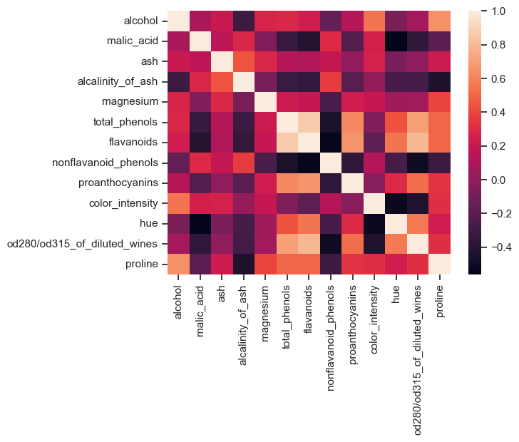 Correlation diagram of the Wine dataset. If data variables correlate too strongly with each other, one of the correlating variables should be excluded from the dataset.
In the Wine dataset, there are variables that are highly correlated with each other. However, in this example we do not remove any of the columns (for reasons of illustration).
Adequacy test
Before we perform the factor analysis, we need to assess the “factorability” of our dataset. Factorability means “Can we find factors in our dataset?”. There are two methods for testing factorability or sampling adequacy:
- Bartlett’s test for sphericity, and
- Kaiser-Meyer-Olkin test.
Bartlett’s test of sphericity checks that the observed variables are not correlated against the identity matrix, when using the observed correlation matrix. If the test was statistically insignificant, one should not perform factor analysis:
chi_square_value,p_value=calculate_bartlett_sphericity(df)
print(chi_square_value, p_value)
> 710.8879087307123 1.355608444801746e-150
The second value is the p-value of Bartlett’s test, here: $\sim$0. Therefore, the test was statistically significant, indicating that the observed correlation matrix was not correlated with the identity matrix.
The Kaiser-Meyer-Olkin (KMO) test measures the adequacy of data for factor analysis. It determines the adequacy for each observed variable and for the entire model. It estimates the proportion of variance between all observed variables: the lower the proportion, the more suitable the data are for factor analysis. KMO values range from 0 to 1. A KMO value of less than 0.6 is considered inadequate:
kmo_all,kmo_model=calculate_kmo(df)
print(kmo_model)
> 0.7767342022065797
With a KMO of $\sim$0.8 we can conclude that our data are suitable for factor analysis.
Estimating the number of required factors
To estimate the number of required factors, we can use a scree plot based on eigenvalues. An eigenvalue of more than one means that the factor explains more variance than a unique variable. An eigenvalue of 2.5 means that the factor would explain the variance of 2.5 variables, and so on. Here we choose the number of eigenvalues greater than one (so-called Kaiser criterion) to be considered as the targeted number of factors. To obtain the eigenvalues, we perform an initial factor analysis “blindly” (i.e., without specifying the number of factors):
# perform preliminary factor analysis:
fa = FactorAnalyzer()
fa.fit(df)

# check eigenvalues:
ev, v = fa.get_eigenvalues()

# scree plot for validating the number of factors:
plt.figure(figsize=(5, 3))
plt.scatter(range(1, df.shape1+1), ev)
plt.plot(range(1, df.shape1+1), ev)
plt.title('Scree Plot')
plt.xlabel('Faktor')
plt.ylabel('Eigenwert')
plt.grid()
plt.show()
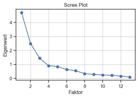
Scree plot for validating the number of factors. The Kaiser criterion is used to determine the number of factors.
We make the cut-off at eigenvalue 3, i.e., we will target $N=3$ factors in our factor analysis.
Factor Analysis and factor rotation
We now perform a factor analysis for $N=3$ factors using factor rotation. The idea of rotation is to rotate the factors to achieve a simpler and more interpretable structure. There are many types of rotations. In the following, we use “varimax” rotation, which maximizes the sum of the variance of the quadratic loadings while ensuring that the factors created are not correlated (orthogonality):
# re-perform factor analysis, now with 2 factors:
fa = FactorAnalyzer(n_factors=3, rotation='varimax')
fa.fit(df)
Checking the factor loadings
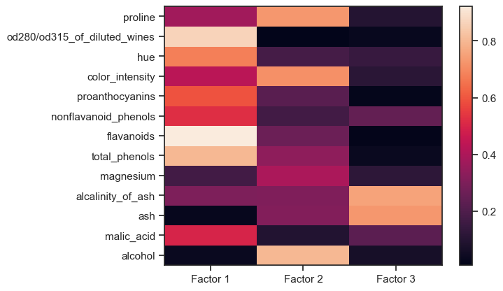
The factor loadings are a matrix that shows the relationship of each variable to the underlying factor. It shows the correlation coefficient for the observed variable and the factor, that is, it shows the variance explained by the observed variables. The higher a factor loading, the more important a variable is to that factor:
# extract factor loadings and factors:
factor_loadings = fa.loadings_
factor_communalities = fa.get_communalities()
factors = fa.transform(df)

# create a dataframe for the factor loadings:
df_loadings = pd.DataFrame(data=factor_loadings, columns='Factor 1', 'Factor 2', 'Factor 3')
df_loadings'Feature' = input_data.feature_names

Z=np.abs(factor_loadings)
plt.pcolor(Z)
plt.colorbar()
ax = plt.gca()
ax.set_yticks(np.arange(factor_loadings.shape0)+0.5, minor=False)
ax.set_xticks(np.arange(factor_loadings.shape1)+0.5, minor=False)
ax.set_yticklabels(df.keys())
ax.set_xticklabels("Factor 1", "Factor 2", "Factor 3")
plt.show()

Factor loadings of the Wine dataset. The higher a factor loading, the more important a variable is to that factor.
Here, “factors” is the actual dimension-reduced dataset, i.e., our “new” variables. So, in our example, we have reduced 13 high-dimensional variables to three new latent variables that describe well the underlying labels (wine classes) of the Wine dataset.
For factor 1, the following factors are obviously relevant,
- od280/od312 …
- hue
- proanthocyanins
- nonflavonid_phenols
- flavanoids
- total_phenols
- malic_acid
while for factor 2
- proline
- color_density
- alcohol
and for factor 3
- alcalinity_of_ash
- ash
are most relevant. Based on this distribution of factor loadings, our three factors can be “interpreted” as follows:
- Factor 1 describes the bulk of the major chemical constituents of wine,
- Factor 2 describes a property composed of the $\alpha$-amino acid (proline), color density, and alcohol content of the wine; and
- Factor 3 describes the component of ash in wine.
Let’s consider how much of the total variance within the dataset is covered by the three factors:
# get variance of each factors:
factor_variance = fa.get_factor_variance()
factor_variance_df = pd.DataFrame(data=factor_variance, columns='Factor 1', 'Factor 2','Factor 3',
                                  index='SS Loadings', 'Proportion Var', 'Cumulative Var')
print(factor_variance_df)
                Factor 1  Factor 2  Factor 3
SS Loadings     3.997571  2.319182  1.270732
Proportion Var  0.307505  0.178399  0.097749
Cumulative Var  0.307505  0.485904  0.583653
Only 58% of the cumulative variance is covered by the three factors. This is not very good, but we leave it at that for a better understanding of the factors. Theoretically, however, one can try to include one or two more factors, as also suggested by the scree plot above.
Visual inspection of the factors
Finally, we can visually inspect the factors using scatter plots:
"""visualize the factors together with the original classes
in order to check if the factors separate the classes well:"""
colors = ['r', 'g', 'b']
fig = plt.figure()
ax = fig.add_subplot(111, projection='3d')
for target, color in zip(target_names, colors):
    indices = input_data.target == input_data.target_names.tolist().index(target)
    ax.scatter(factors[indices, 0], factors[indices, 1], factors[indices, 2], c=color, label=target)
ax.view_init(elev=35, azim=45)
ax.set_xlabel('Factor 1')
ax.set_ylabel('Factor 2')
ax.set_zlabel('Factor 3')
ax.set_title('Factors of Wine Dataset')
ax.zaxis.labelpad=-3.9
ax.legend()
plt.show()

fig, axs = plt.subplots(1, 3, figsize=(12, 4))  # Adjust the figure size as needed
# "XY" projection:
for target, color in zip(target_names, colors):
    indices = input_data.target == input_data.target_names.tolist().index(target)
    axs[0].scatter(factors[indices, 0], factors[indices, 1], c=color, label=target)
axs[0].set_xlabel('Factor 1')
axs[0].set_ylabel('Factor 2')
axs[0].set_title('XY Projection')
# "XZ" projection:
for target, color in zip(target_names, colors):
    indices = input_data.target == input_data.target_names.tolist().index(target)
    axs[1].scatter(factors[indices, 0], factors[indices, 2], c=color, label=target)
axs[1].set_xlabel('Factor 1')
axs[1].set_ylabel('Factor 3')
axs[1].set_title('XZ Projection')
# "YZ" projection:
for target, color in zip(target_names, colors):
    indices = input_data.target == input_data.target_names.tolist().index(target)
    axs[2].scatter(factors[indices, 1], factors[indices, 2], c=color, label=target)
axs[2].set_xlabel('Factor 2')
axs[2].set_ylabel('Factor 3')
axs[2].set_title('YZ Projection')
plt.show()
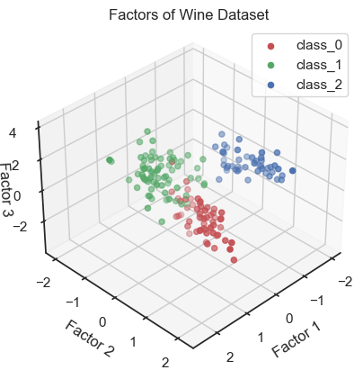
Scatter plot of the three factors (3D scatter plot).
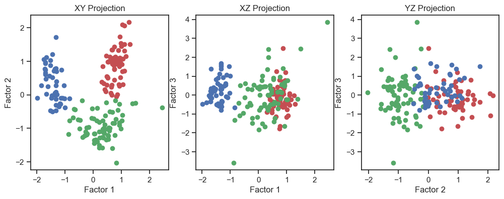
Scatter plot of the three factors (2D projections).
In the 3D plot and especially in the 2D projections (in particular the “XY” projection), we see that we are be able to draw interpretive conclusions from the dataset using factor analysis. On the one hand, we could use the projections to identify classes and thus identify distinct groups within the dataset. On the other hand, we can see that there is a nonlinear dependence of the factors and we could, for example, fit a quadratic function.
Verification of the correspondence of the factors with the real classes
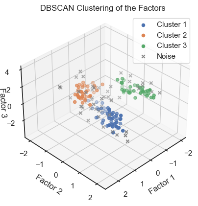
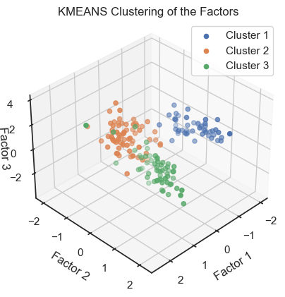
To verify that we can indeed re-identify the three wine classes within the reduced dataset, we cluster the factors once with DBSCAN and once with Kmeans:
""" Verify reproducibility by "blindly" (unsupervised)
identifying clusters from the factors (i.e., do the
clusters match with the actual classes?): """
dbscan = DBSCAN(eps=0.46, min_samples=5)
dbscan_labels = dbscan.fit_predict(factors)
dbscan_labels_unique = set(dbscan_labels)

fig = plt.figure()
ax = fig.add_subplot(111, projection='3d')
for label in dbscan_labels_unique:
    if label ==-1:
        cluster_points = factors[dbscan_labels==label]
        ax.scatter(cluster_points[:,0], cluster_points[:,1], cluster_points[:,2], marker="x",
                   label="Noise", color="grey")
    else:
        cluster_points = factors[dbscan_labels==label]
        ax.scatter(cluster_points[:,0], cluster_points[:,1], cluster_points[:,2],
                   label=f"Cluster {label+1}")
ax.view_init(elev=35, azim=45)
ax.set_xlabel('Factor 1')
ax.set_ylabel('Factor 2')
ax.set_zlabel('Factor 3')
ax.set_title('DBSCAN Clustering of the Factors')
ax.zaxis.labelpad=-3.9
ax.legend()
plt.show()

fig, axs = plt.subplots(1, 3, figsize=(12, 4))  # Adjust the figure size as needed
# XY projection:
for label in dbscan_labels_unique:
    if label ==-1:
        cluster_points = factors[dbscan_labels==label]
        axs[0].scatter(cluster_points[:,0], cluster_points[:,1], marker="x",
                   label="Noise", color="grey")
    else:
        cluster_points = factors[dbscan_labels==label]
        axs[0].scatter(cluster_points[:,0], cluster_points[:,1],
                   label=f"Cluster {label+1}")
axs[0].set_xlabel('Factor 1')
axs[0].set_ylabel('Factor 2')
axs[0].set_title('DBSCAN classes XY Projection')
# XZ projection:
for label in dbscan_labels_unique:
    if label ==-1:
        cluster_points = factors[dbscan_labels==label]
        axs[1].scatter(cluster_points[:,0], cluster_points[:,2], marker="x",
                   label="Noise", color="grey")
    else:
        cluster_points = factors[dbscan_labels==label]
        axs[1].scatter(cluster_points[:,0], cluster_points[:,2],
                   label=f"Cluster {label+1}")
axs[1].set_xlabel('Factor 1')
axs[1].set_ylabel('Factor 3')
axs[1].set_title('DBSCAN classes XZ Projection')
# YZ projection:
for label in dbscan_labels_unique:
    if label ==-1:
        cluster_points = factors[dbscan_labels==label]
        axs[2].scatter(cluster_points[:,1], cluster_points[:,2], marker="x",
                   label="Noise", color="grey")
    else:
        cluster_points = factors[dbscan_labels==label]
        axs[2].scatter(cluster_points[:,1], cluster_points[:,2],
                   label=f"Cluster {label+1}")
axs[2].set_xlabel('Factor 2')
axs[2].set_ylabel('Factor 3')
axs[2].set_title('DBSCAN classes YZ Projection')
and
kmeans = KMeans(n_clusters=3, random_state=0)
kmeans_labels = kmeans.fit_predict(factors)
kmeans_labels_unique = set(kmeans_labels)

fig = plt.figure()
ax = fig.add_subplot(111, projection='3d')
for label in kmeans_labels_unique:
    cluster_points = factors[kmeans_labels==label]
    ax.scatter(cluster_points[:,0], cluster_points[:,1], cluster_points[:,2],
                   label=f"Cluster {label+1}")
ax.view_init(elev=35, azim=45)
ax.set_xlabel('Factor 1')
ax.set_ylabel('Factor 2')
ax.set_zlabel('Factor 3')
ax.set_title('KMEANS Clustering of the Factors')
ax.zaxis.labelpad=-3.9
ax.legend()
plt.show()

fig, axs = plt.subplots(1, 3, figsize=(12, 4))  # Adjust the figure size as needed
# XY projection:
for label in kmeans_labels_unique:
    cluster_points = factors[kmeans_labels==label]
    axs[0].scatter(cluster_points[:,0], cluster_points[:,1],
                   label=f"Cluster {label+1}")
axs[0].set_xlabel('Factor 1')
axs[0].set_ylabel('Factor 2')
axs[0].set_title('KMEANS classes XY Projection')
# XZ projection:
for label in kmeans_labels_unique:
    cluster_points = factors[kmeans_labels==label]
    axs[1].scatter(cluster_points[:,0], cluster_points[:,2],
                   label=f"Cluster {label+1}")
axs[1].set_xlabel('Factor 1')
axs[1].set_ylabel('Factor 13')
axs[1].set_title('KMEANS classes XZ Projection')
# YZ projection:
for label in kmeans_labels_unique:
    cluster_points = factors[kmeans_labels==label]
    axs[2].scatter(cluster_points[:,1], cluster_points[:,2],
                   label=f"Cluster {label+1}")
axs[2].set_xlabel('Factor 2')
axs[2].set_ylabel('Factor 3')
axs[2].set_title('KMEANS classes YZ Projection')

 Factors with color-assignments regarding the original classes (2D projections).
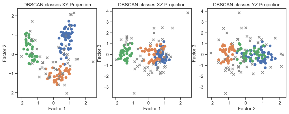 DBSCAN clustering of the factors. (2D projections).
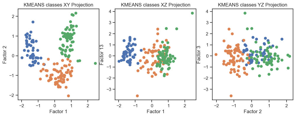 Kmeans clustering of the factors. (2D projections).
With both cluster methods we would be able to re-identify the three known wine classes. I.e., for any future “blind” (=not yet classified) new data, we would be able to make a prediction using factor and cluster analysis.
Conclusion
Factor Analysis (FA), similar to PCA, is a powerful tool to reduce the dimensionality of high-dimensional datasets. It can be used to identify the most important (and latent) features of a dataset and to reduce the number of features to a manageable number. The reduced feature set can be utilized for subsequent analysis, such as identifying patterns in the data through techniques like clustering, classification, or regression.
If you have any questions or suggestions, feel free to leave a comment below or reach out to me on Mastodonꜛ. If you want to learn more about Factor Analysis, I recommend the following resources:
- Factor Analysis on Wikipediaꜛ
- Introduction to Factor Analysis in Pythonꜛ on datacamp.com
- Principles and Practice of Structural Equation Modelingꜛ by Rex B. Kline
- Foundations of Factor Analysisꜛ by Stanley A. Mulaik
The entire code used in this post is also available in this GitHub repositoryꜛ.
In the next post, we will look at Autoencoders (AE), which are a special type of neural network, that can be used for dimensionality reduction as well.


comments