t-Distributed Stochastic Neighbor Embedding (t-SNE)
t-distributed Stochastic Neighbor Embedding (t-SNE) is a non-linear dimensionality reduction method specifically designed for the visualization of high-dimensional datasets in low-dimensional spaces, typically 2D or 3D. It is widely used in machine learning, bioinformatics, and other fields where high-dimensional data need to be visualized and explored.
The main goal of t-SNE is to preserve the local structure of the high-dimensional data, meaning that similar points in the high-dimensional space will remain close in the lower-dimensional embedding, while dissimilar points will be pushed further apart.
t-SNE achieves this by defining probabilities that represent similarities between points in both the high-dimensional and low-dimensional spaces, then minimizing the difference between these two probability distributions.
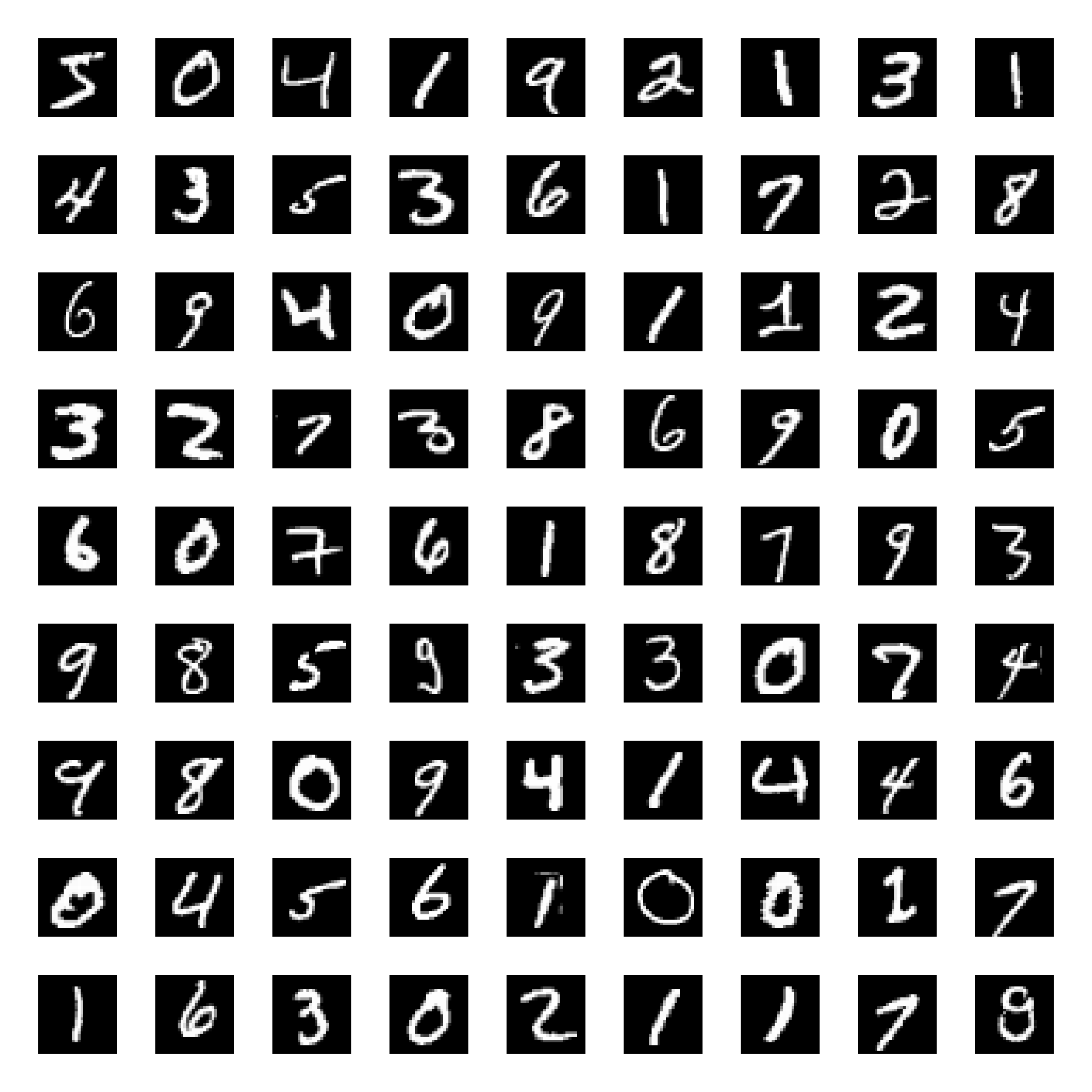
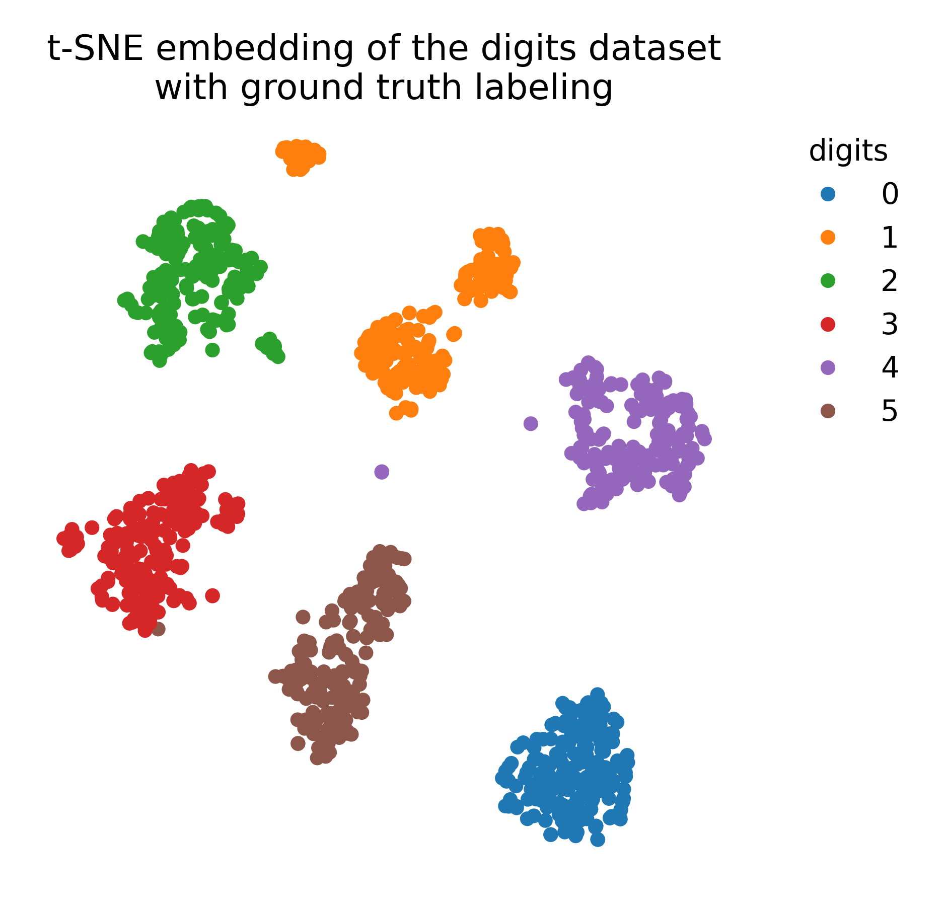
t-SNE embedding (right) of the digits dataset (left).
Key concepts in t-SNE
In the following sections, we summarize the key concepts in t-SNE:
High-dimensional probabilities
t-SNE models the similarity between two points $x_i$ and $x_j$ in the high-dimensional space as the probability that $x_j$ would be picked as a neighbor of $x_i$. This similarity is modeled using a Gaussian distribution centered at $x_i$, and the probability of $x_j$ being a neighbor is given by:
\[p_{j|i} = \frac{\exp\left(-||x_i - x_j||^2 / 2 \sigma_i^2 \right)}{\sum_{k \neq i} \exp\left(-||x_i - x_k||^2 / 2 \sigma_i^2 \right)}\]Here, $\sigma_i$ is the bandwidth parameter, and the Gaussian distribution ensures that closer points in high-dimensional space have higher probabilities of being neighbors.
Low-dimensional probabilities
In the low-dimensional space, t-SNE models the similarity between points $y_i$ and $y_j$ using a Student’s t-distribution (specifically, a Cauchy distribution):
\[q_{ij} = \frac{(1 + ||y_i - y_j||^2)^{-1}}{\sum_{k \neq l} (1 + ||y_k - y_l||^2)^{-1}}\]The choice of the t-distribution (with heavier tails than a Gaussian) allows for more flexibility in the low-dimensional space, ensuring that distant points can be modeled appropriately.
KL Divergence
t-SNE aims to minimize the difference between the probability distributions $p_{ij}$ (in high-dimensional space) and $q_{ij}$ (in low-dimensional space). This difference is measured using the Kullback-Leibler (KL) divergence, which quantifies how much one probability distribution diverges from another:
\[KL(P || Q) = \sum_{i \neq j} p_{ij} \log \frac{p_{ij}}{q_{ij}}\]The algorithm uses gradient descent to iteratively adjust the points $y_i$ in the low-dimensional space, minimizing the KL divergence and preserving local structure.
Algorithm overview
1. Compute pairwise similarities in high-dimensional space:
For each point $x_i$, compute the conditional probability $p_{j|i}$ that represents the similarity between points using a Gaussian kernel.
2. Symmetrize the probabilities:
To ensure symmetry, the joint probability of similarity between two points $x_i$ and $x_j$ is defined as:
\[p_{ij} = \frac{p_{j|i} + p_{i|j}}{2n}\]3. Initialize low-dimensional points:
The low-dimensional points $y_i$ are initialized randomly or by using another dimensionality reduction technique, such as PCA, to provide a starting point for optimization.
4. Compute pairwise similarities in low-dimensional space:
Compute the probability $q_{ij}$ using a t-distribution, which models similarities in the low-dimensional space.
5. Minimize the KL divergence:
Use gradient descent to adjust the positions of points $y_i$ in the low-dimensional space, minimizing the KL divergence between $p_{ij}$ and $q_{ij}$.
The role of perplexity in t-SNE
Perplexity is a crucial hyperparameter in t-SNE that controls the balance between focusing on local versus global structure. It can be thought of as controlling the effective number of neighbors each point considers when constructing the probability distributions in the high-dimensional space. Perplexity is defined as:
\[\text{Perplexity} = 2^{H(P_i)}\]where $H(P_i)$ is the Shannon entropy of the conditional probability distribution $P_i$.
- Low perplexity: Focuses on capturing local structures by emphasizing nearby neighbors.
- High perplexity: Focuses more on global structure, considering larger neighborhoods.
The choice of perplexity affects the outcome of t-SNE visualizations, and typical values range from 5 to 50, depending on the dataset.
Advantages and limitations of t-SNE
Advantages:
- Captures non-linear structures: t-SNE is particularly good at preserving local structures and capturing non-linear relationships in the data.
- Effective for high-dimensional data: It excels at visualizing complex datasets such as images, gene expression data, and word embeddings, where non-linear relationships are prevalent.
- Local neighborhood preservation: By preserving local distances, t-SNE ensures that similar data points remain close in the low-dimensional representation.
Limitations:
- Computational complexity: t-SNE can be slow for large datasets due to the need to compute pairwise distances between all points. However, variants such as Barnes-Hut t-SNE or FIt-SNE help reduce this complexity.
- Global structure distortion: t-SNE may distort global relationships between clusters, making it difficult to interpret large-scale structures.
- Parameter sensitivity: The choice of parameters, particularly perplexity, can significantly impact the quality of the visualization. This often requires trial and error to find the right balance for the dataset.
- Instability: Due to random initialization, different runs of t-SNE with the same data can produce different results, depending on the random seed used.
Practical considerations
- Preprocessing: It is essential to preprocess the data by normalizing or standardizing features to ensure meaningful results, as t-SNE is sensitive to the scale of input data.
- Dimensionality reduction before t-SNE: For very high-dimensional data, applying a method like PCA before t-SNE can help reduce noise and make the algorithm more efficient.
- Multiple trials: Running t-SNE multiple times with different random seeds can ensure that the visualizations are consistent and reliable.
Conclusion
t-SNE is a powerful tool for visualizing high-dimensional data, especially when it comes to preserving local relationships between data points. It is widely used in machine learning, bioinformatics, and data visualization fields for exploring complex datasets with non-linear structures. While it excels in capturing local patterns, users must be cautious about interpreting global structures and must consider the impact of hyperparameters such as perplexity. Despite its computational challenges, t-SNE remains one of the most popular techniques for dimensionality reduction in visualization tasks.
Python example
In this example, we will again use the MNIST dataset, that consists of 70,000 grayscale images of handwritten digits (0-9) with a resolution of 28x28 pixels. We will apply t-SNE to visualize the high-dimensional image data in a 2D space and compare the results with the ground truth labels. We will also apply k-means clustering to the embedded data to explore potential clusters in the low-dimensional space.
 Samples from the MNIST dataset.
Let’s start by loading the dataset. We will load the digits dataset and only use six first of the ten available classes:
import os
import numpy as np
import matplotlib.pyplot as plt
from sklearn.datasets import load_digits
from sklearn.preprocessing import MinMaxScaler
from sklearn.manifold import TSNE
from sklearn.cluster import KMeans
from sklearn.decomposition import PCA

digits = load_digits(n_class=6)
X, y = digits.data, digits.target
n_samples, n_features = X.shape
n_neighbors = 30
We use the MinMaxScaler to standardize the data before applying t-SNE:
# standardize the data:
X = MinMaxScaler().fit_transform(X)
Next, we apply t-SNE to the standardized data:
# t-SNE embedding of the digits dataset
tsne = TSNE(n_components=2, init='pca', random_state=0, verbose=1)
X_tsne = tsne.fit_transform(X)
To visualize the results, we plot the t-SNE embedding with and without ground truth color coding:
DIGIT_COLORS = {
    "0": "#1f77b4",
    "1": "#ff7f0e",
    "2": "#2ca02c",
    "3": "#d62728",
    "4": "#9467bd",
    "5": "#8c564b"
    }

# plot the t-SNE embedding w/o ground truth color coding:
plt.figure(figsize=(5.15, 6))
plt.scatter(X_tsne[:, 0], X_tsne[:, 1], c="k", cmap=plt.cm.tab10, alpha=0.5)
plt.title("t-SNE embedding of the digits dataset\nwithout ground truth labeling")
plt.xticks([])
plt.yticks([])
plt.show()

# plot the t-SNE embedding with ground truth color coding:
plt.figure(figsize=(6.25, 6))
colors = plt.cm.tab10(y)
plt.scatter(X_tsne[:, 0], X_tsne[:, 1], c=colors, cmap=plt.cm.tab10)
plt.title("t-SNE embedding of the digits dataset\nwith ground truth labeling")
plt.xticks([])
plt.yticks([])
# add a 'colorbar' that matches the cell types:
handles = [plt.Line2D([0], [0], marker='o', color='w', markerfacecolor=color, markersize=8, label=label)
           for label, color in DIGIT_COLORS.items()]
plt.legend(handles=handles, title="digits", bbox_to_anchor=(1.05, 1), loc='upper left', frameon=False)
plt.show()
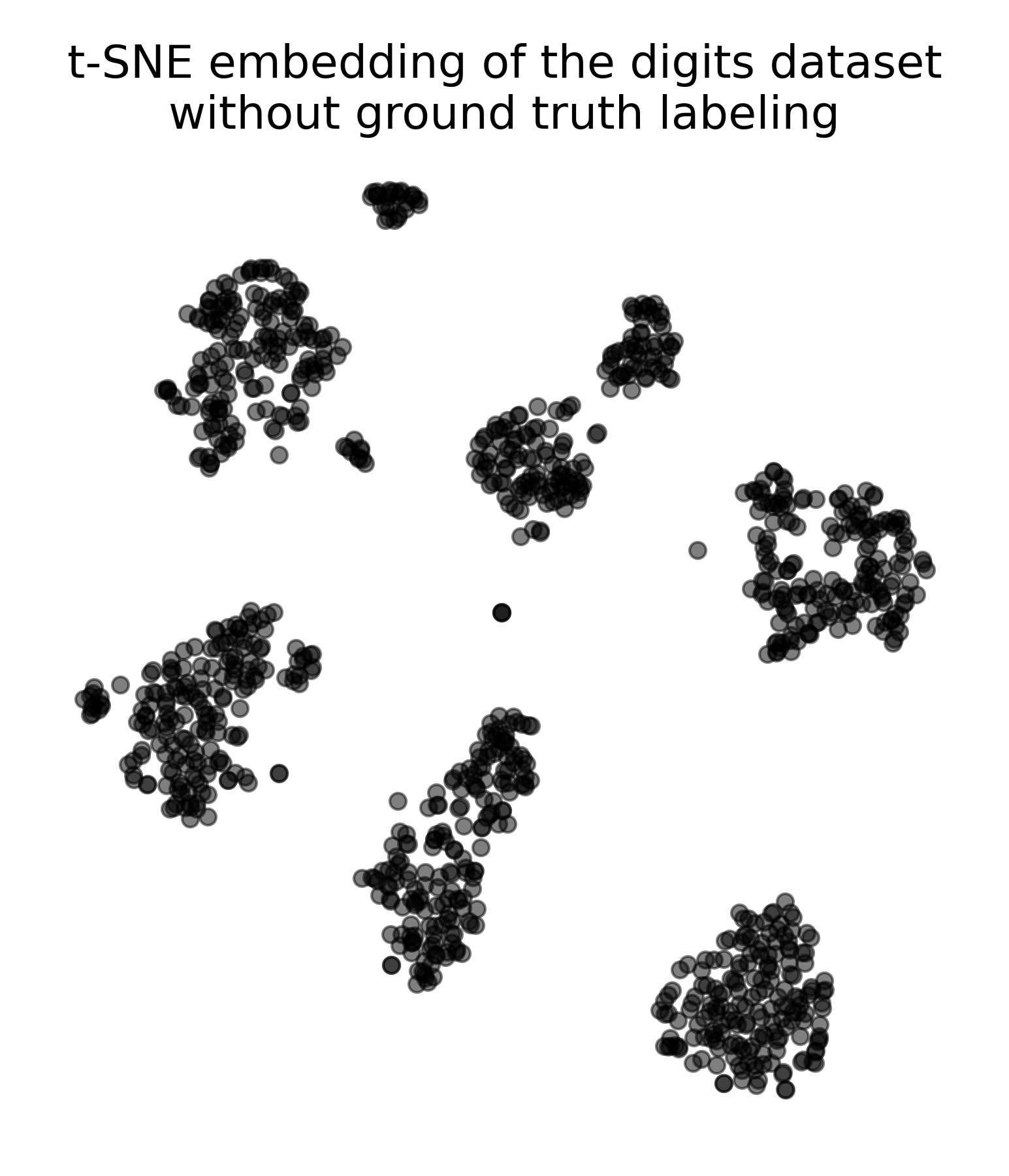 t-SNE embedding of the digits dataset without ground truth labeling.
 t-SNE embedding of the digits dataset with ground truth labeling.
We can also apply k-means clustering to the t-SNE embedding to explore potential clusters in the low-dimensional space (e.g., in case no ground truth labels are available):
# apply k-means clustering to the t-SNE embedding:
kmeans = KMeans(n_clusters=6, random_state=0)
kmeans_labels = kmeans.fit_predict(X_tsne)

# plot the t-SNE embedding with k-means cluster labels:
plt.figure(figsize=(7, 6))
plt.scatter(X_tsne[:, 0], X_tsne[:, 1], c=kmeans_labels, cmap=plt.cm.tab10)
plt.title("t-SNE embedding of the digits dataset\nwith KMeans clustering")
plt.xticks([])
plt.yticks([])
# add a 'colorbar' that matches the cell types:
# create a dictionary to assign the cluster labels the tab10 colors:
cluster_to_color = {i: plt.cm.tab10(i) for i in range(6)}
handles = [plt.Line2D([0], [0], marker='o', color='w', markerfacecolor=plt.cm.tab10(i), markersize=8,
                      label=f"Cluster {i}")
           for i in range(6)]
plt.legend(handles=handles, title="Cluster", bbox_to_anchor=(1.05, 1), loc='upper left', frameon=False)
plt.show()
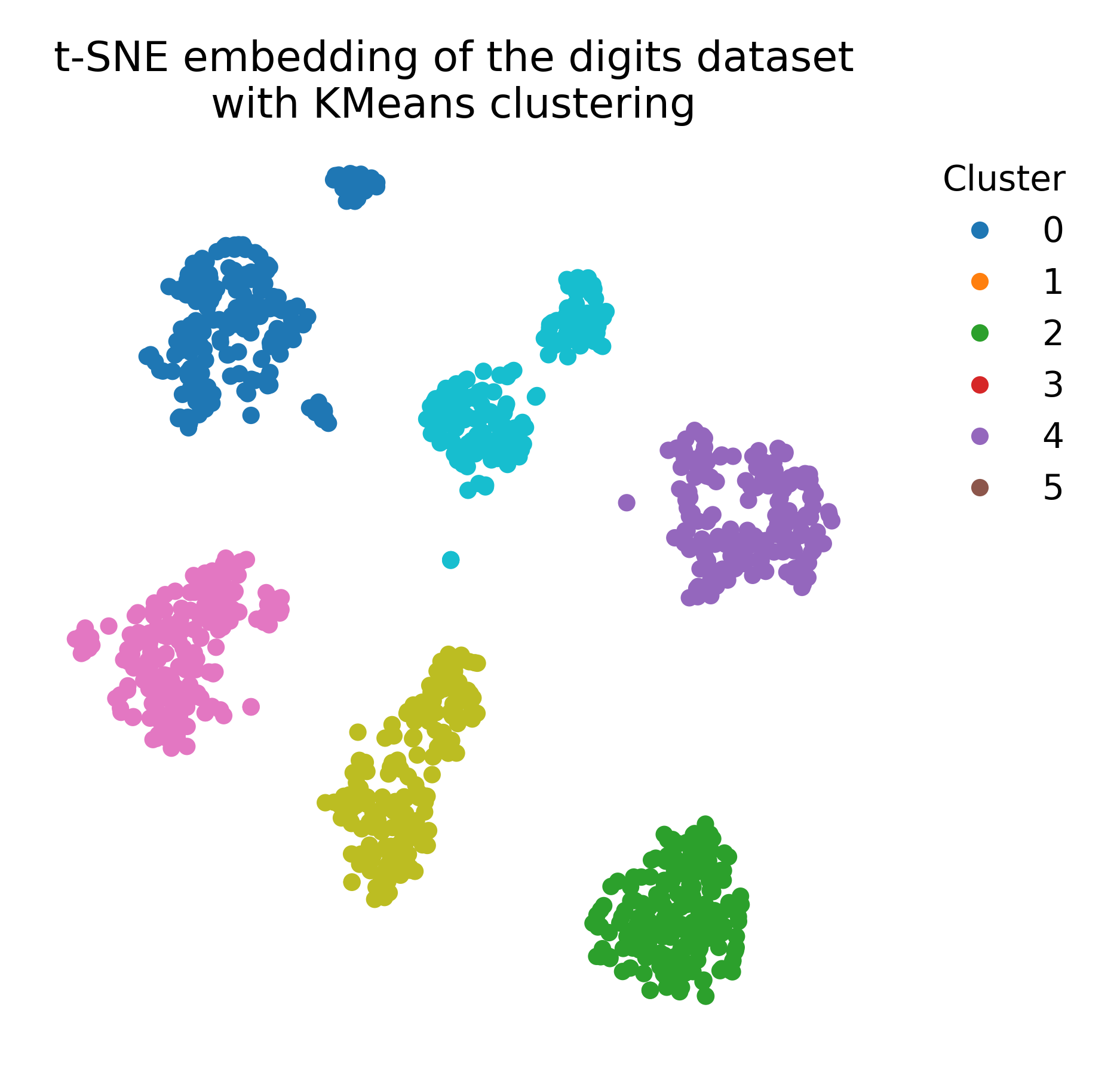

k-means clustering applied to the t-SNE embedding of the digits dataset (left), compared to the ground truth labeling (right).
For comparison, we apply PCA to the data to demonstrate the differences between t-SNE and PCA:
pca = PCA(n_components=2)
X_pca = pca.fit_transform(X)

# plot the PCA embedding with ground truth color coding:
plt.figure(figsize=(6, 6))
colors = plt.cm.tab10(y)
plt.scatter(X_pca[:, 0], X_pca[:, 1], c=colors, cmap=plt.cm.tab10)
plt.title("PCA embedding of the digits dataset\nwith ground truth labeling")
plt.xticks([])
plt.yticks([])
# add a 'colorbar' that matches the cell types:
handles = [plt.Line2D([0], [0], marker='o', color='w', markerfacecolor=color, markersize=8, label=label)
           for label, color in DIGIT_COLORS.items()]
plt.legend(handles=handles, title="digits", bbox_to_anchor=(1.05, 1), loc='upper left', frameon=False)
plt.show()
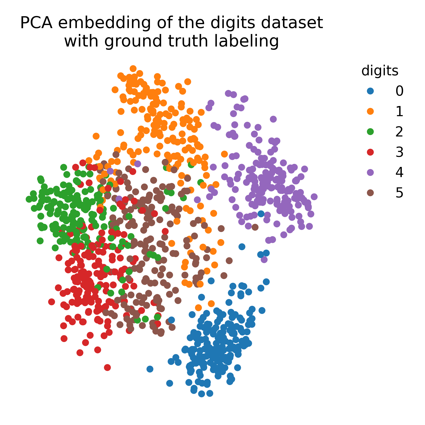 PCA embedding of the digits dataset with ground truth labeling.
Exercise
In the exercise, we will apply t-SNE to a RNAseq dataset and explore the resulting low-dimensional embedding. We will compare the t-SNE visualization with the ground truth labels and vary the parameters of the model to observe the impact on the embedding.
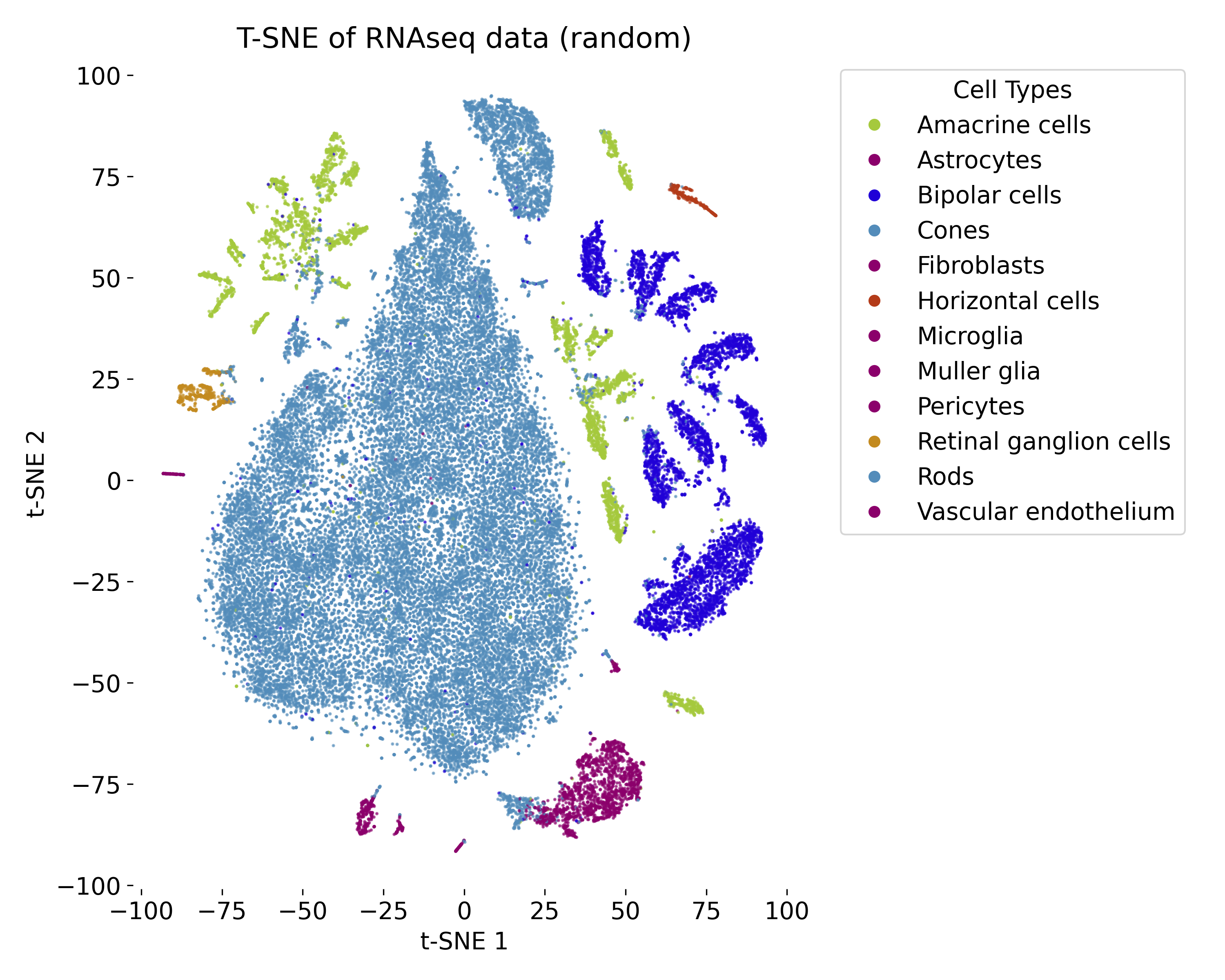 t-SNE plot of the RNAseq dataset with random initialization.
