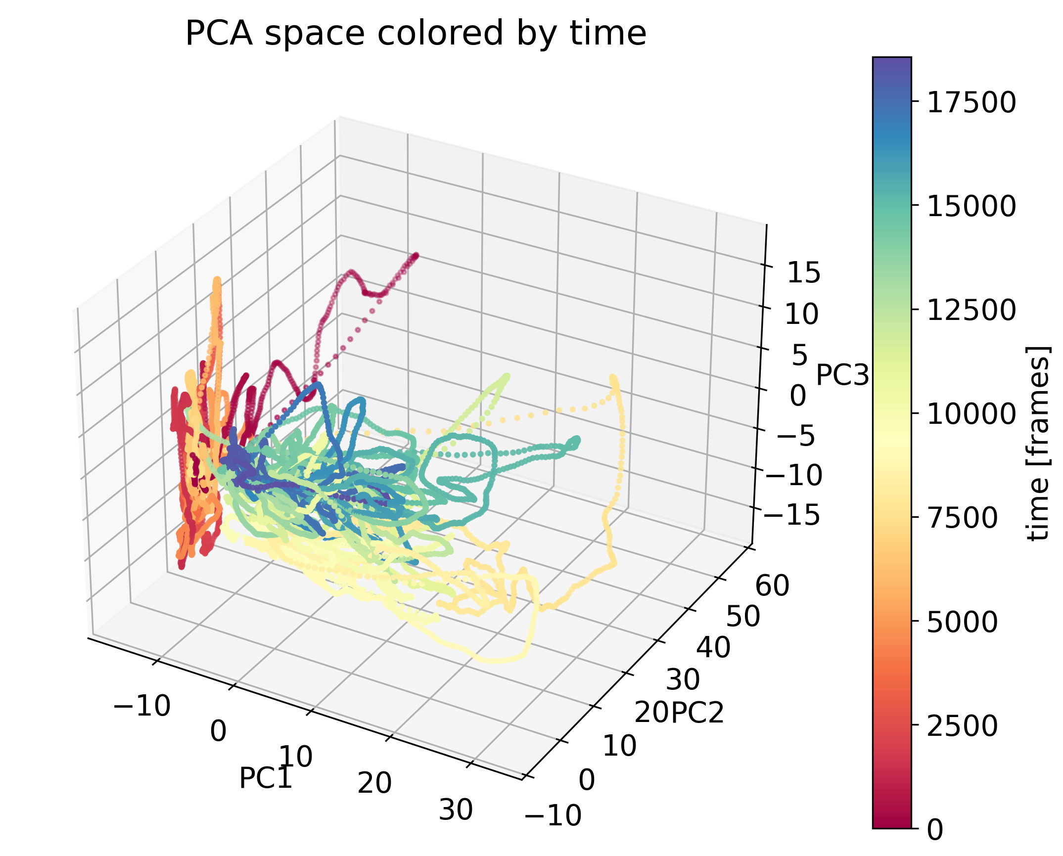
Principal component analysis (PCA)
Principal Component Analysis (PCA) is a fundamental technique in data science used for dimensionality reduction. It transforms a high-dimensional dataset into a set of orthogonal variables, known as principal components, which capture the maximum variance present in the data. By projecting the data into a lower-dimensional space, PCA simplifies the dataset while retaining its most important features, facilitating analysis and visualization.
Using PCA for data dimensionality reduction in Python.
Key concepts in PCA
- Variance: In PCA, the primary goal is to maximize the variance in the projected dimensions. Variance represents how spread out the data points are in a particular direction, and PCA identifies the directions that capture the most variance.
- Principal Components: These are the new axes in the transformed space, formed as linear combinations of the original features. Each principal component captures a specific portion of the variance in the data:
- The first principal component captures the maximum variance.
- The second principal component captures the second-highest variance, and it is orthogonal to the first.
- Each successive component captures progressively less variance, and all components are mutually orthogonal.
- Orthogonality: The principal components are orthogonal, meaning that each component captures unique information. This ensures no redundancy in the transformed feature space.
PCA can be viewed as a way of reorienting the data to identify the most meaningful directions in which the data varies, thus simplifying analysis while retaining core information.
PCA algorithm
The Principal Component Analysis (PCA) algorithm follows several key steps to reduce the dimensionality of a dataset while preserving as much variance as possible. PCA relies on linear algebra concepts such as the covariance matrix and eigenvalue decomposition to transform the data into a new coordinate system based on principal components.
1. Standardization of the data
Before applying PCA, the dataset needs to be standardized by subtracting the mean $\mu$ of each feature $X_{\text{raw}}$ and scaling the data to have unit variance $\sigma$:
\[X = \frac{X_{\text{raw}} - \mu}{\sigma}\]This ensures that features with different scales or units (e.g., temperature in Celsius vs. height in centimeters) do not dominate the results.
2. Compute the covariance matrix
Once the data is standardized, we need to compute the covariance matrix $\mathbf{S}$ to capture the relationships between different features in the dataset. The covariance matrix describes how pairs of features vary together:
\[\mathbf{S} = \frac{1}{n-1} \sum_{i=1}^{n} (\mathbf{x}_i - \mathbf{\mu}) (\mathbf{x}_i - \mathbf{\mu})^T\]$\mathbf{x}_i$ are the standardized data points, $\mathbf{\mu}$ is the mean vector, and $n$ is the number of samples. Alternatively, when written in matrix form for the standardized data $\mathbf{X}$, the covariance matrix can be computed as:
\[\mathbf{S} = \frac{1}{n-1} \mathbf{X}^T \mathbf{X}\]The covariance matrix summarizes the variability of the data and the relationships between different features.
3. Eigenvalue decomposition
PCA works by performing eigenvalue decomposition on the covariance matrix $\mathbf{S}$. This decomposition provides eigenvectors and eigenvalues:
\[\mathbf{S} \mathbf{v}_i = \lambda_i \mathbf{v}_i\]- Eigenvectors $\mathbf{v}_i$ correspond to the directions of the new principal component axes.
- Eigenvalues $\lambda_i$ represent the variance explained by each principal component. The larger the eigenvalue, the more variance is captured by the corresponding eigenvector.
These eigenvectors form the new axes of the transformed data space, and each eigenvalue tells us how much of the dataset’s variability is captured by the corresponding axis (principal component).
4. Select principal components
The eigenvectors (principal components) are sorted in descending order based on their corresponding eigenvalues. The top $k$ eigenvectors — those that explain the most variance — are selected to form a transformation matrix $\mathbf{W}$. The number $k$ is typically chosen to retain a large portion of the variance (e.g., 90% or 95%).
5. Transform the data
The final step in PCA is projecting the data onto the selected principal components, yielding a reduced-dimensional dataset. This transformation is done using the eigenvectors (principal components):
\[\mathbf{X}_{\text{new}} = \mathbf{X} \mathbf{W}\]Here, $\mathbf{X}_{\text{new}}$ is the transformed data in the lower-dimensional space, and $\mathbf{W}$ is the matrix of the selected eigenvectors. This lower-dimensional representation captures the most important patterns and structures in the data, while ignoring less important variations.
Python example
We can perform all the steps of PCA by hand using the basic Python library NumPy.
Let’s first generate some random two-dimensional data, i.e., a dataset with two features. We could think of this data as representing the activity of two neurons, for example:
import numpy as np
import matplotlib.pyplot as plt

# generate random two-dimensional data:
np.random.seed(1)
mean = [0, 0]
cov = [[1.5, 0.75], [0.75, 1.5]]
X = np.random.multivariate_normal(mean, cov, 100)

# visualization of the data:
plt.figure(figsize=(6, 6))
plt.scatter(X[:, 0], X[:, 1])
plt.title('Original Data')
plt.xlabel('Neuron 1')
plt.ylabel('Neuron 2')
plt.xticks(np.arange(-2,2.1,1))
plt.yticks(np.arange(-2,2.1,1))
plt.grid(True)
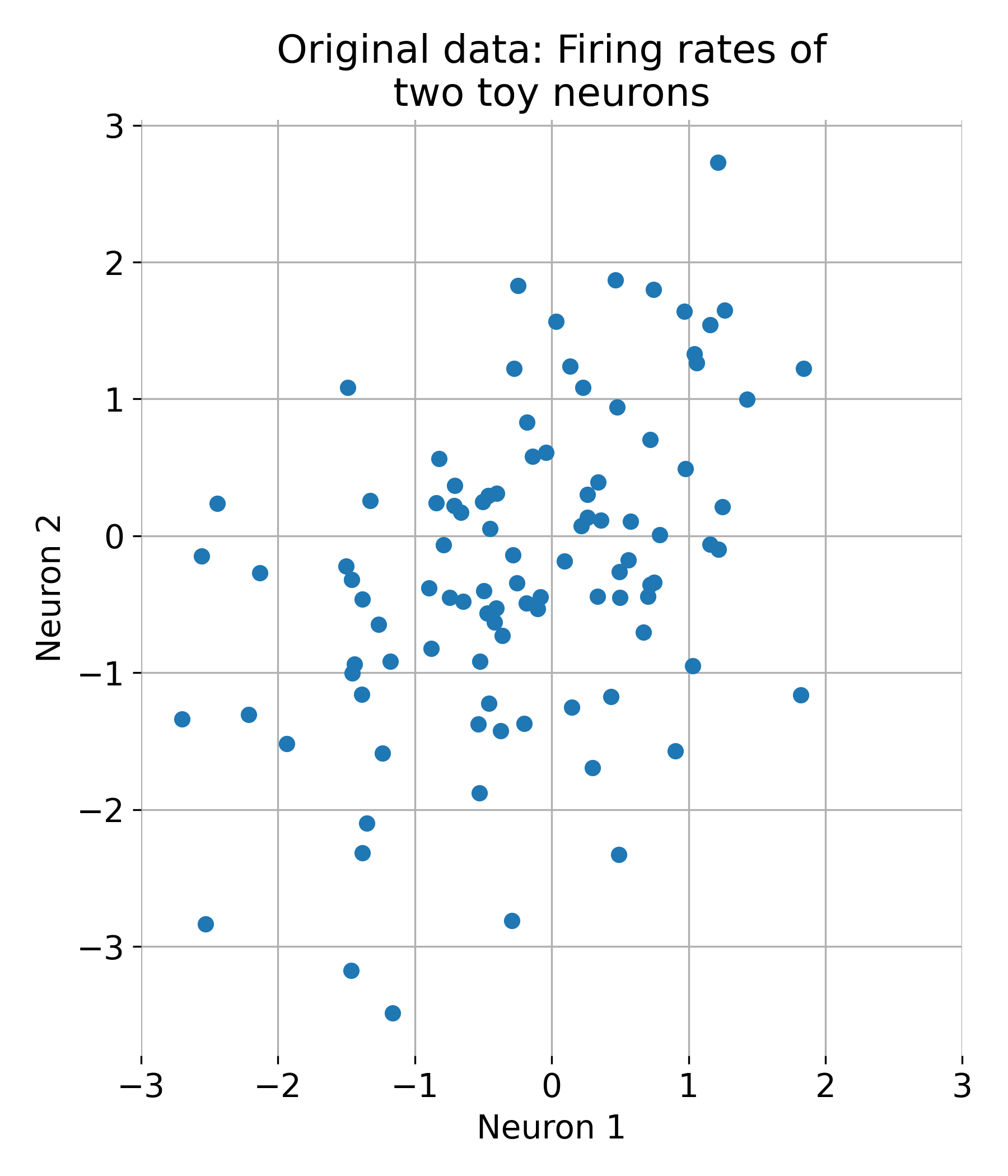
Original dataset with two features (two neurons).
First, we standardize the data:
# centering the data:
X_centered = X - np.mean(X, axis=0)

# scaling of the data:
X_scaled = X_centered / np.std(X_centered, axis=0)
Next, we calculate the covariance matrix:
# calculate of the covariance matrix:
cov_matrix = np.cov(X_scaled.T)
Then, we determine the eigenvalues and eigenvectors of the covariance matrix and sort the eigenvectors in descending order:
# calculation of the eigenvalues and eigenvectors:
eigenvalues, eigenvectors = np.linalg.eig(cov_matrix)

# sorting the eigenvectors according to descending eigenvalues:
sorted_indices = np.argsort(eigenvalues)[::-1]
eigenvalues = eigenvalues[sorted_indices]
eigenvectors = eigenvectors[:, sorted_indices]
The sorted eigenvectors represent the principal components of our data:
# projecting the data onto the principal components:
projected_data = np.dot(X_scaled, eigenvectors[:, :2])

# visualization of the main components in the original space of data:
plt.figure(figsize=(6, 6))
plt.scatter(X[:, 0], X[:, 1])
plt.quiver(np.mean(X[:, 0]), np.mean(X[:, 1]), eigenvectors[0, 0], eigenvectors[1, 0],
           color='red', scale=2, label='Principal Component 1')
plt.quiver(np.mean(X[:, 0]), np.mean(X[:, 1]), eigenvectors[0, 1], eigenvectors[1, 1],
           color='blue', scale=3, label='Principal Component 2')
plt.title('Principal Components in Original Data Space')
plt.xlabel('Feature 1')
plt.ylabel('Feature 2')
plt.legend()
plt.grid(True)
plt.show()
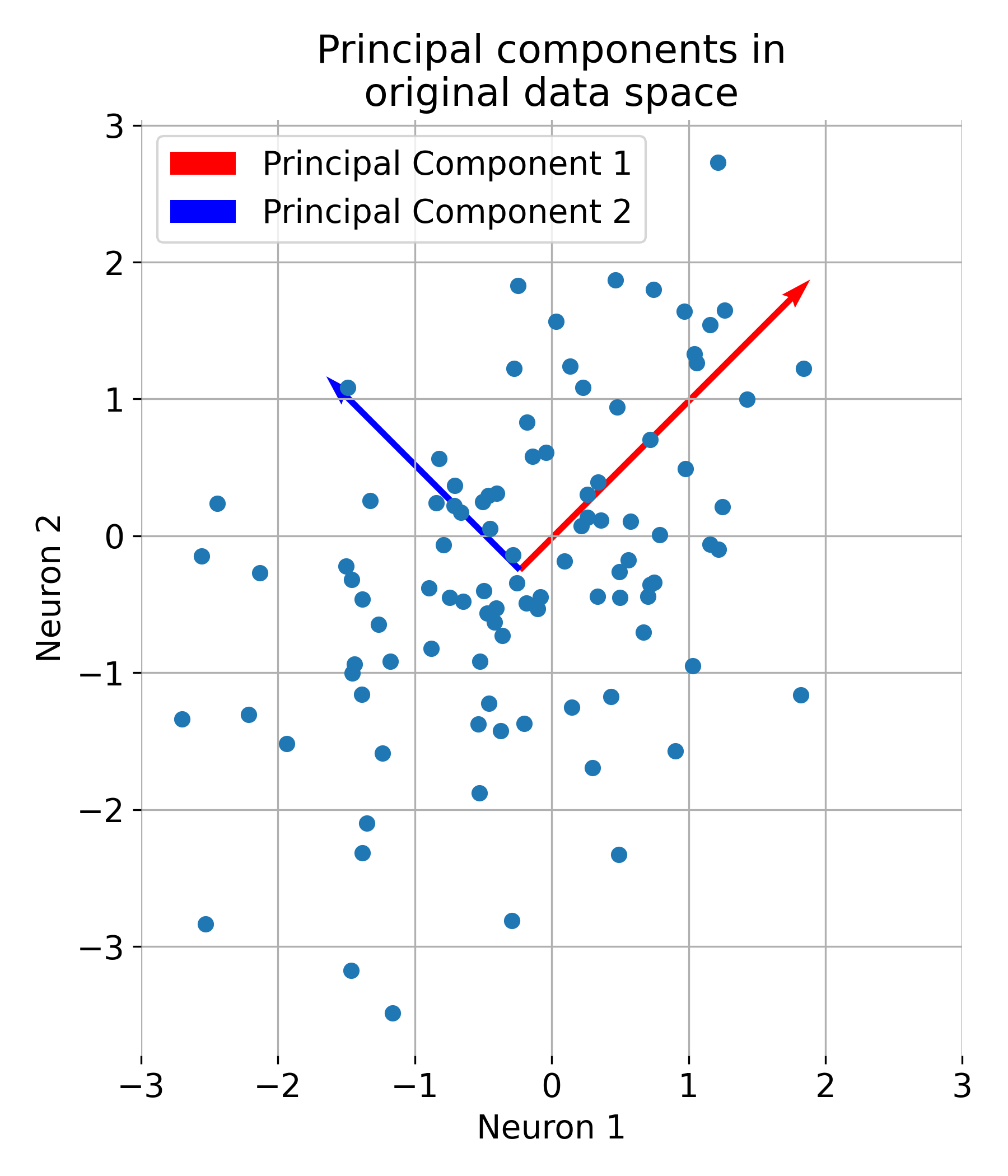
The first two principal components plotted into the original data space.
Let us further understand what PCA is actually doing. The eigenvectors represent the directions of maximum variance in the data. The first principal component (red) captures the direction of maximum variance, while the second principal component (blue) captures the next highest variance, orthogonal to the first:
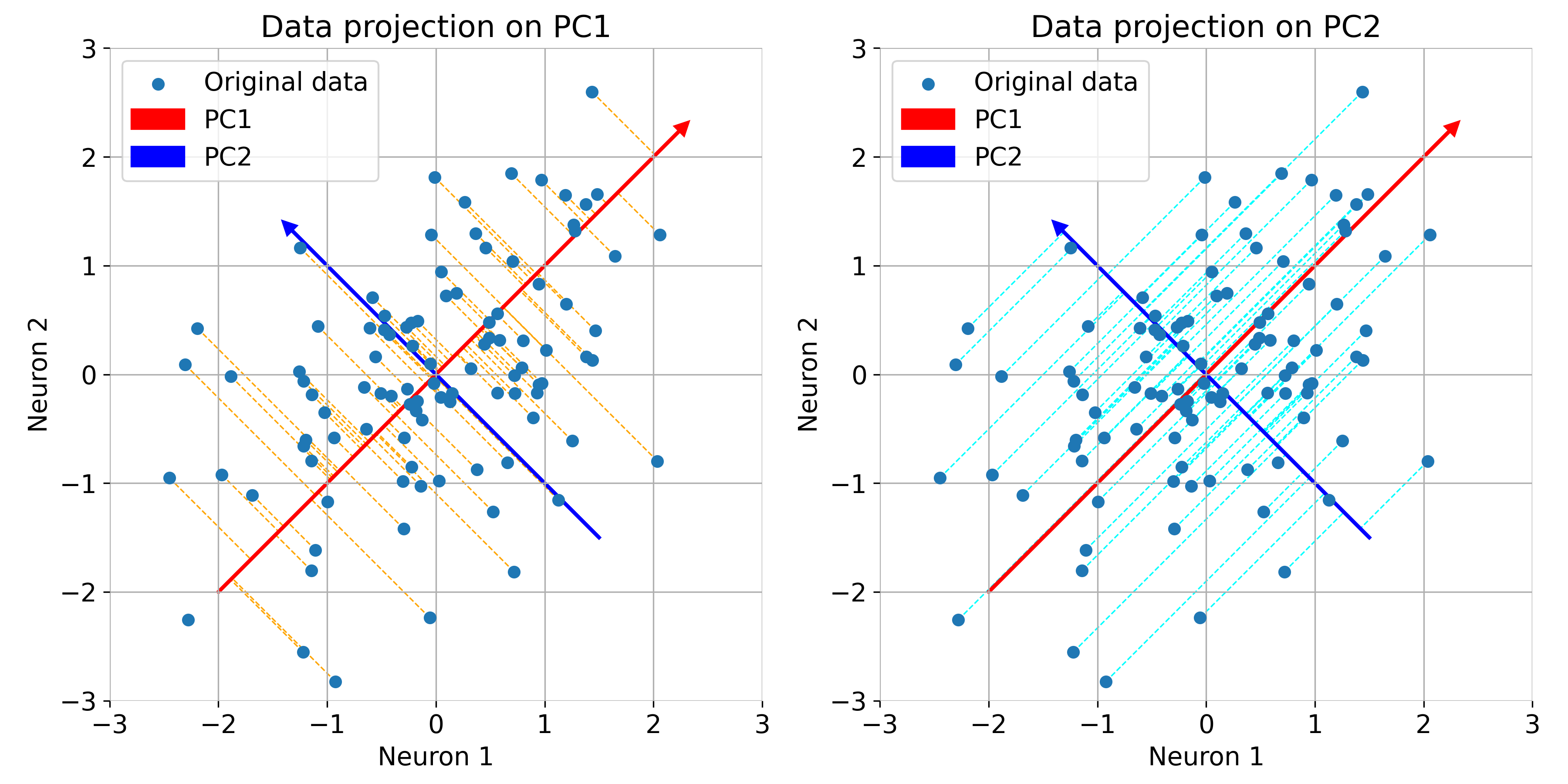
Same plot as before, but now illustrated with orthogonal projections of the data points onto the principal components.
If the principal components are note properly aligned with the data, the overall variance of the data is not captured efficiently, i.e., the variance along the principal components is not maximized. This can be seen in the following example, where we rotate the principal components by 20 degrees and recalculate the projections of the data onto the rotated PCs:
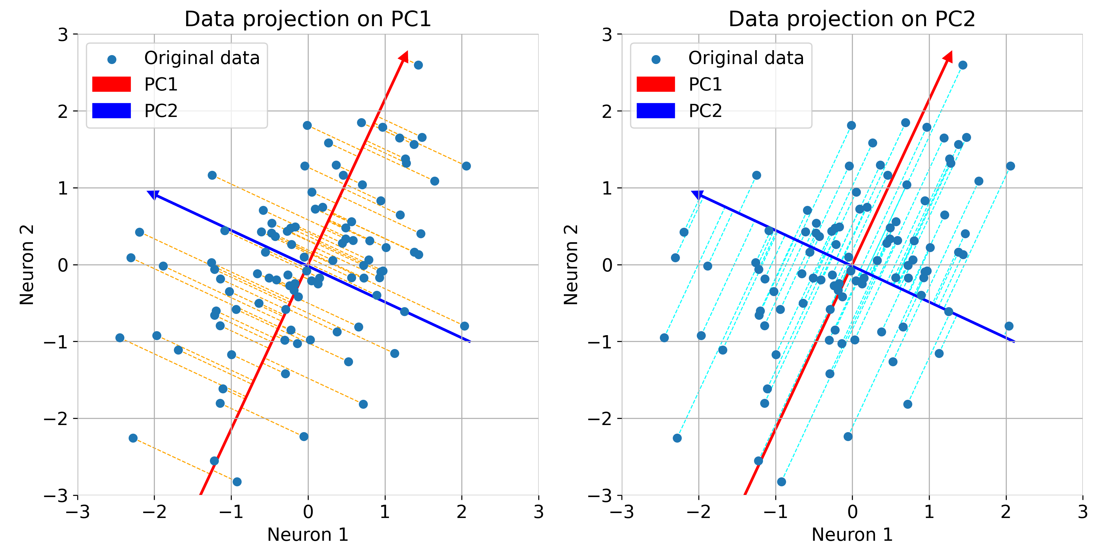
Same plot as before, but now with rotated principal components. Note, that the variance of the data is not maximized along the principal components.
The principal components provide a new basis for the data, simplifying the representation while retaining the most important information (for $N_\text{feature}\gt2$).
Finally, we project the data onto the principal components:
# visualize the data on the first two main components (transformed data):
plt.figure(figsize=(6, 6))
plt.scatter(projected_data[:, 0], projected_data[:, 1])
plt.title('Data Projected onto First Two Principal Components')
plt.xlabel('Principal Component 1')
plt.ylabel('Principal Component 2')
plt.grid(True)
plt.show()
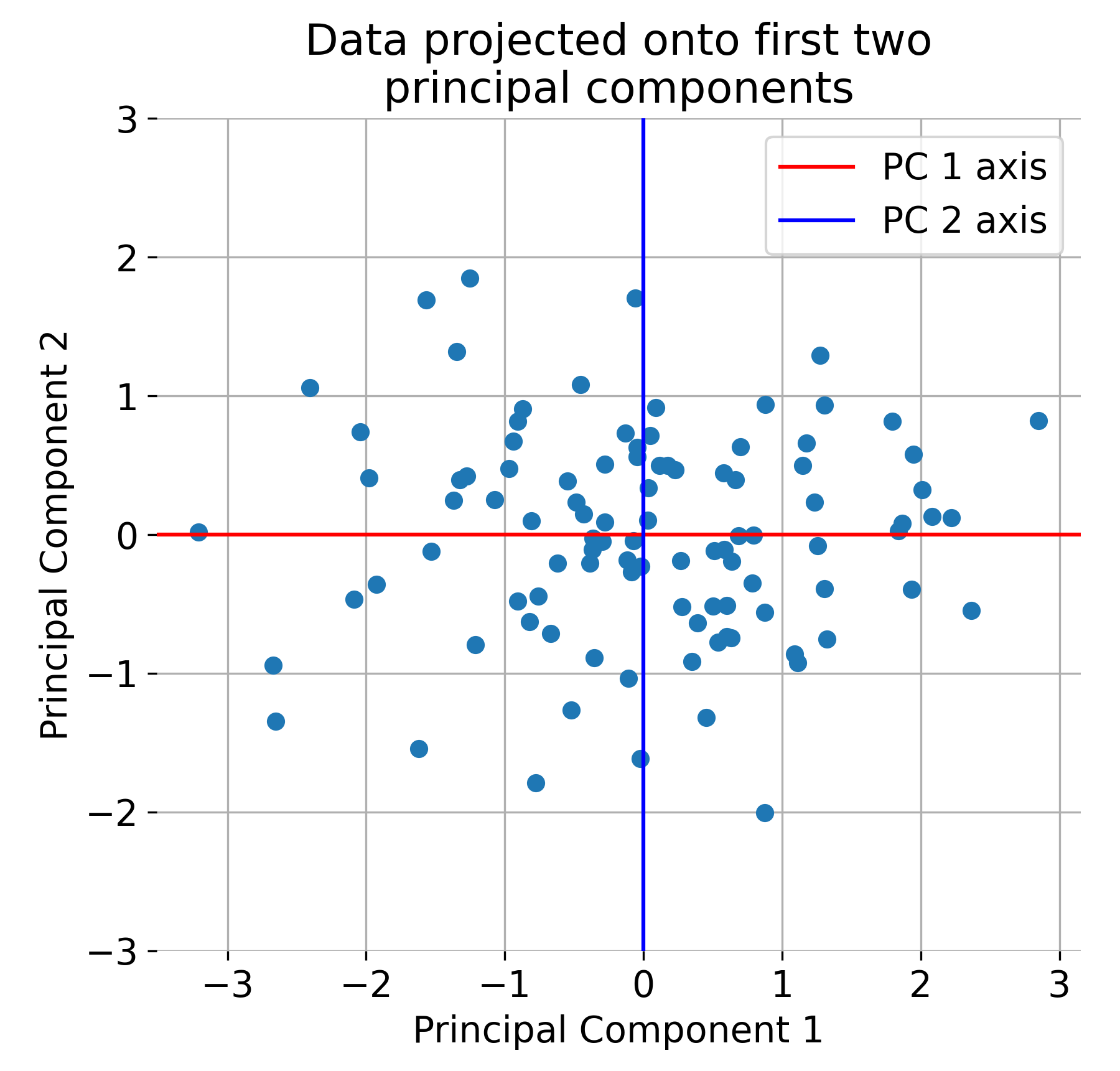
The original dataset projected onto the first two principal components.
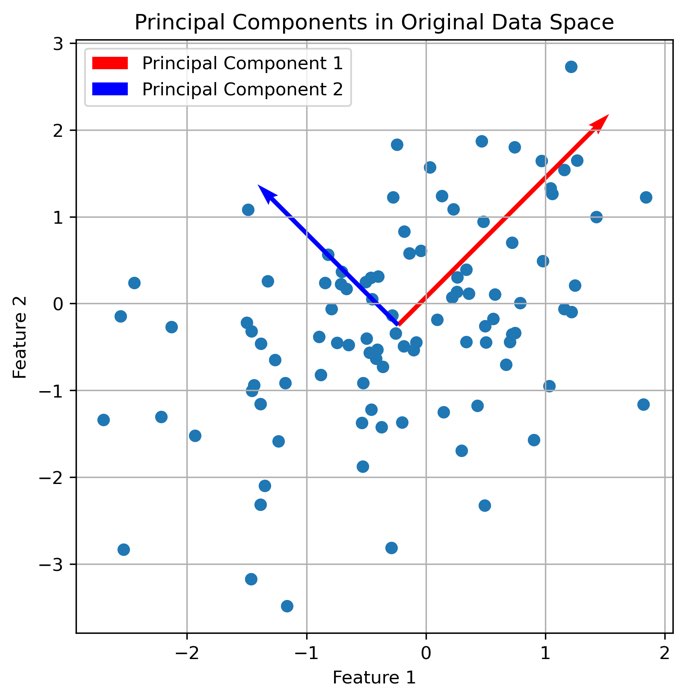
This example depicts the basic steps of PCA. In fact, a dimensionality reduction from two dimension (two features; here: two neurons) to two PCA dimensions is not that useful. However, for high-dimensional data, e.g., if we would have 100 features (100 neurons), PCA can be a powerful tool to reduce the dimensionality of the data while retaining the most important information. In such cases, PCA PCA projects the data points of the 100 features from the 100-dimensional space onto a lower-dimensional space, e.g., 2D or 3D, depending on the number of principal components selected.
Principal components and variance explained
Each principal component corresponds to one of the eigenvectors $\mathbf{v}_i$, which represents a specific direction of variance in the data. The corresponding eigenvalue $\lambda_i$ tells us how much variance is explained by that component. The proportion of variance explained by each component is given by:
\[\frac{\lambda_i}{\sum_{j=1}^{p} \lambda_j}\]where $p$ is the total number of features. By summing the eigenvalues, we can determine how many components are needed to capture a desired percentage of the total variance.
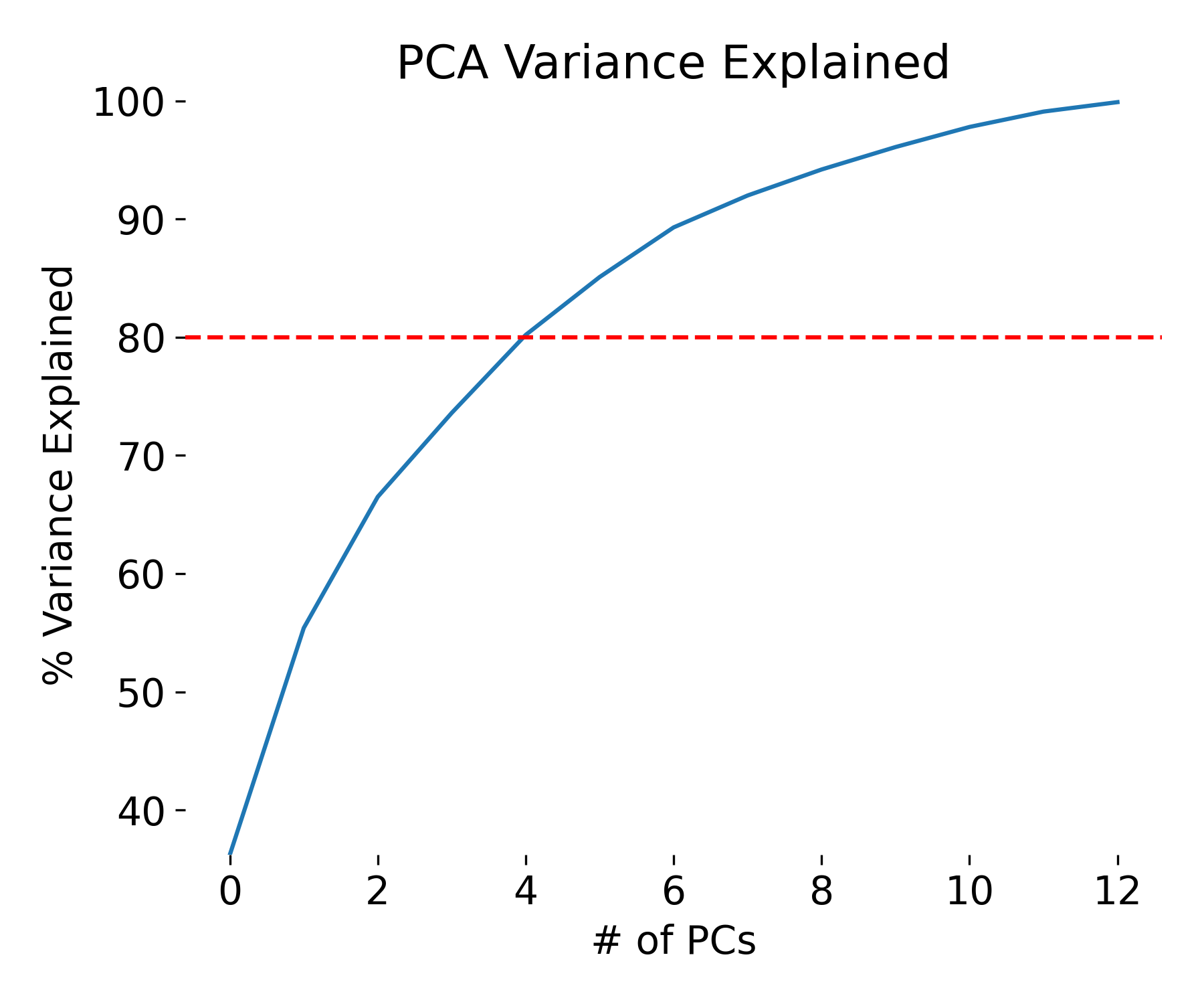
Example plot of the variance explained by each principal component.
Scree plot and choosing the number of components
A Scree Plot is a common tool used to decide how many principal components to retain. It plots the eigenvalues in descending order and helps identify a natural cutoff point, often referred to as the “elbow” of the plot. Components to the left of the elbow explain the majority of the variance, while those to the right contribute less significantly.
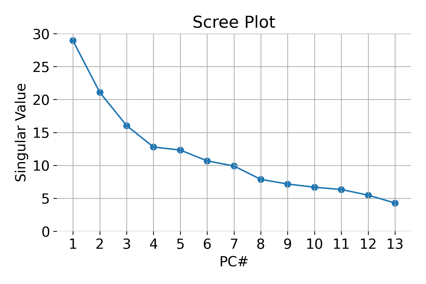 Example of a scree plot for validating the number of relevant principal components.
To choose the optimal number of components, we typically aim to retain a cumulative variance of around 80-95%. This ensures that we are capturing the most important aspects of the data while reducing its dimensionality.
Advantages and limitations of PCA
Advantages:
- Dimensionality reduction: PCA reduces the number of features in a dataset while retaining the most important information, simplifying analysis.
- Noise reduction: By focusing on components with the most variance, PCA naturally reduces noise and irrelevant information.
- Feature interpretation: PCA transforms correlated features into uncorrelated components, which can simplify the interpretation of the dataset by eliminating redundancy.
Limitations:
- Linear assumption: PCA assumes that the relationships between variables are linear. It may not capture complex, nonlinear patterns present in the data.
- Interpretability: Since the principal components are linear combinations of the original features, they may not always be easy to interpret.
- Sensitivity to scaling: PCA is sensitive to the scaling of the data, so standardizing features is critical to ensuring meaningful results.
Conclusion
PCA is a widely used technique for dimensionality reduction, helping to simplify complex datasets by retaining the most important variance. It is especially useful for visualization, feature extraction, and noise reduction in datasets with correlated features. However, it is limited to linear relationships and may not always be interpretable.
Use Cases: PCA is commonly applied in areas such as data visualization, noise reduction, and as a preprocessing step for machine learning models that require reduced dimensionality. It is a powerful tool for handling high-dimensional data in many scientific and practical applications.
Python example: PCA on a high-dimensional data set
Here is an example of applying PCA to a real-world dataset, the Wine dataset from the UCI Machine Learning Repository. The dataset contains 13 features representing chemical properties of wines, and the goal is to reduce the dimensionality of the data while preserving the most important information.
Let’s first load the dataset and explore its properties:
import os
import numpy as np
import pandas as pd
import matplotlib.pyplot as plt

from sklearn.datasets import load_wine
from sklearn.decomposition import PCA
from sklearn.preprocessing import StandardScaler

# load the Wine dataset:
input_data = load_wine()

# extract the data:
X = input_data.data

# extract feature names names:
feature_names = input_data.feature_names

# standardize the data:
X_Factor = StandardScaler().fit_transform(X)
df = pd.DataFrame(data=X_Factor, columns=input_data.feature_names)

# we put everything into a dataframe for better visualization and data handling:
df_full = df.copy()
df_full['Target'] = input_data.target
target_names = input_data.target_names

# let's explore the data:
print(f"Shape of the dataset: {df.shape} (13 features with 178 samples)")
print(f"Feature names: {feature_names}")
print(f"Target names: {target_names}")
The Wine dataset consists indeed of
- 178 samples, each with
- 13 features:
['alcohol', 'malic_acid', 'ash', 'alcalinity_of_ash', 'magnesium', 'total_phenols', 'flavanoids', 'nonflavanoid_phenols', 'proanthocyanins', 'color_intensity', 'hue', 'od280/od315_of_diluted_wines', 'proline'], - which can be divided into three classes:
['class_0' 'class_1' 'class_2'](= ground truth (GT) labels ).
Before we apply PCA, we explore the number of principal components needed to capture the variance in the data. We visualize the Scree Plot to determine the optimal number of components:
# Explore the number of necessary PCA:
pca_explore = PCA(n_components=13)
pca_fit_explore = pca_explore.fit_transform(X_Factor)
ev = pca_explore.singular_values_

# Scree plot for validating the number of factors:
plt.figure(figsize=(6, 4))
plt.scatter(range(1, df.shape[1]+1), ev)
plt.plot(range(1, df.shape[1]+1), ev)
plt.title('Scree Plot')
plt.xlabel('PC#')
plt.ylabel('Singular Value')
plt.ylim(0, 30)
plt.xticks(np.arange(1, df.shape[1]+1, 1))
plt.grid()
plt.tight_layout()
plt.show()
 Scree plot for validating the number of relevant principal components. Note, that the $N_\text{component}=13$ is the maximum number of principal components and the number of features in the dataset.
The explained variance tells us how much information (variance) can be attributed to each of the principal components. This is important because while we can convert high-dimensional space to a two- or three-dimensional space, we lose some of the variance (information).
By using the attribute explained_variance_ratio of the PCA object pca_explore, we can see that the first principal component contains XY percent of the variance, the second XY percent and the third XY percent of the variance. Together, the three components contain XY percent of the information. Remember: variance_explained_ratio = eigenvalues / np.sum(eigenvalues):
plt.figure(figsize=(6, 5))
var=np.cumsum(np.round(pca_explore.explained_variance_ratio_, decimals=3) *100)
plt.plot(var)
plt.ylabel("% Variance Explained")
plt.xlabel("# of PCs")
plt.title ("PCA Variance Explained")
plt.ylim(min(var), 100.5)
#plt.style.context ('seaborn-whitegrid')
plt.axhline(y=80, color='r', linestyle='--')
plt.tight_layout()
plt.show()

print(f"Explained variances for all 13 PCs:\n {pca_explore.explained_variance_ratio_}\n")
print(f"Cumulative explained variance for the first 3 PCs: {np.sum(pca_explore.explained_variance_ratio_[0:3])}")
Explained variances for all 13 PCs:
 [0.36198848 0.1920749  0.11123631 0.0706903  0.06563294 0.04935823
 0.04238679 0.02680749 0.02222153 0.01930019 0.01736836 0.01298233
 0.00795215]

Cumulative explained variance for the first 3 PCs: 0.6652996889318523

Variance explained by each principal component.
We can now apply PCA to this dataset with 3 PC and visualize the results:
# perform PCA with 3 components:
pca = PCA(n_components=3)
pca_fit = pca.fit_transform(X_Factor)

# create a dataframe with the 3 components and the target variable:
principal_df = pd.DataFrame(data=pca_fit, columns=['PC1', 'PC2', 'PC3'])
final_df = pd.concat([principal_df, pd.DataFrame(data=input_data.target, columns=['target'])], axis=1)

# visualize the 3 components:
fig = plt.figure()
ax = fig.add_subplot(111, projection='3d')
ax.scatter(pca_fit[:, 0], pca_fit[:, 1], pca_fit[:, 2], c='k',  alpha=0.6)
ax.view_init(elev=35, azim=45)
ax.set_xlabel('PC1')
ax.set_ylabel('PC2')
ax.set_zlabel('PC3', rotation=90)
ax.zaxis.labelpad=-5.5
ax.set_title('PCA of Wine Dataset')
plt.tight_layout()
plt.show()


# visualize the 3 components with their groundtruth labels:
colors = ['r', 'g', 'b']
fig = plt.figure()
ax = fig.add_subplot(111, projection='3d')
for target, color in zip(target_names, colors):
    indices = input_data.target == input_data.target_names.tolist().index(target)
    ax.scatter(pca_fit[indices, 0], pca_fit[indices, 1], pca_fit[indices, 2], c=color, label=target)
ax.view_init(elev=35, azim=45)
ax.set_xlabel('PC1')
ax.set_ylabel('PC2')
ax.set_zlabel('PC3', rotation=90)
ax.zaxis.labelpad=-5.5
ax.set_title('PCA of Wine Dataset with GT labels')
ax.legend()
plt.tight_layout()
plt.show()

# projections:
fig, axs = plt.subplots(1, 3, figsize=(12, 4))
# XY projection:
for target, color in zip(target_names, colors):
    indices = input_data.target == input_data.target_names.tolist().index(target)
    axs[0].scatter(pca_fit[indices, 0], pca_fit[indices, 1], c=color, label=target)
axs[0].set_xlabel('PCA 1')
axs[0].set_ylabel('PCA 2')
axs[0].set_title('PC1 vs PC2')

# XZ projection:
for target, color in zip(target_names, colors):
    indices = input_data.target == input_data.target_names.tolist().index(target)
    axs[1].scatter(pca_fit[indices, 0], pca_fit[indices, 2], c=color, label=target)
axs[1].set_xlabel('PCA 1')
axs[1].set_ylabel('PCA 3')
axs[1].set_title('PC1 vs PC3')

# YZ projection:
for target, color in zip(target_names, colors):
    indices = input_data.target == input_data.target_names.tolist().index(target)
    axs[2].scatter(pca_fit[indices, 1], pca_fit[indices, 2], c=color, label=target)
axs[2].set_xlabel('PCA 2')
axs[2].set_ylabel('PCA 3')
axs[2].set_title('PC2 vs PC3')

plt.tight_layout()
plt.show()
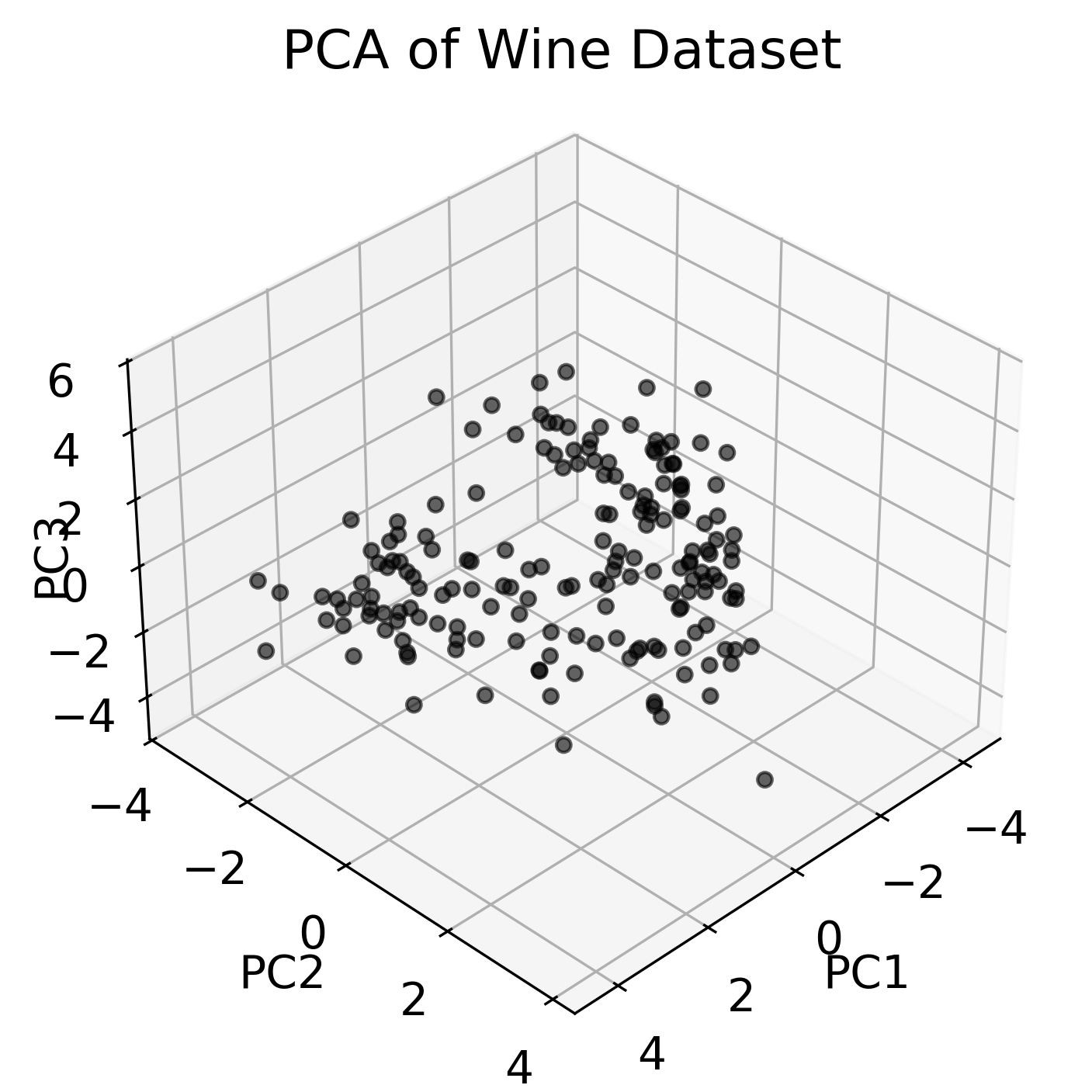
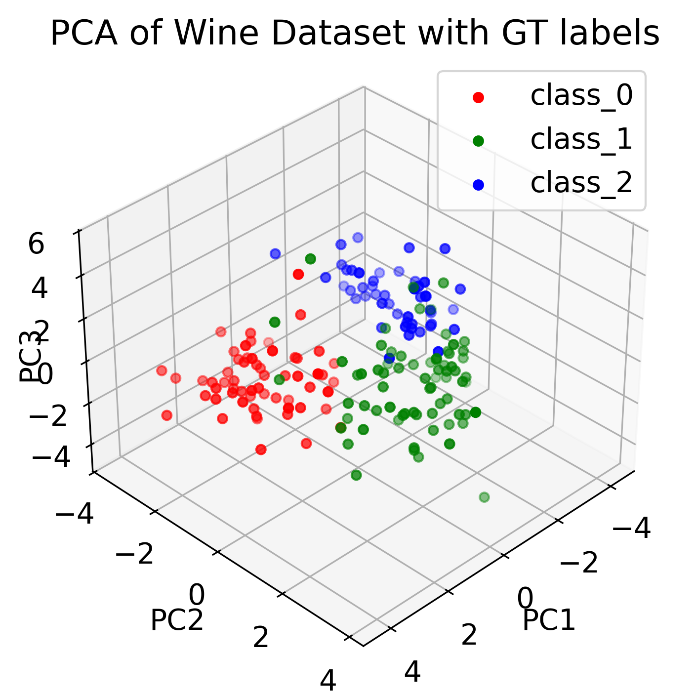
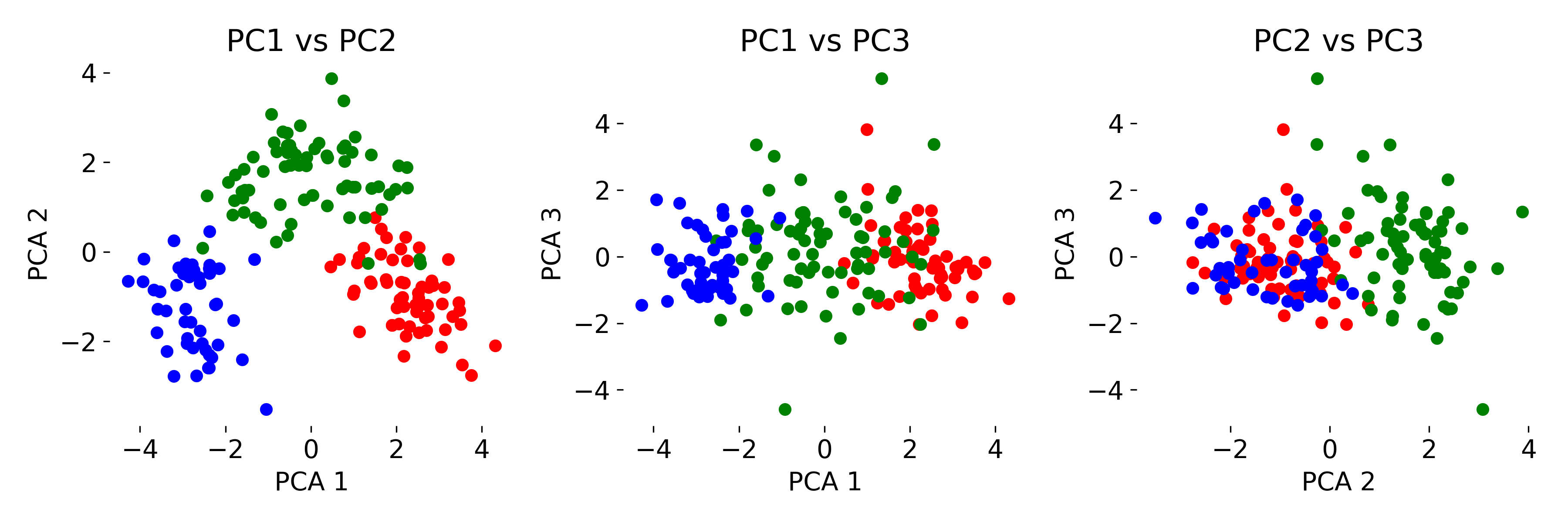 Three-dimensional visualization of the Wine dataset using PCA, showing the first three principal components (left). Thus, we have reduced the 13-dimensional feature space to a 3D space. By color-coding the data points according to the ground truth labels (GT) (right), we can see how the different classes are distributed in the new space. Bottom panel shows the 2D projections of the data points onto the different principal components.
Exercise
In the exercise, you will explore PCA for dimensionality reduction of neural data. We will work with calcium imaging data from one male mouse. The mouse had different visitors in its cage throughout the recording (female or male), associated with a corresponding behavioral response (attack or no attack). With PCA, we will explore the neural responses to these different social stimuli.
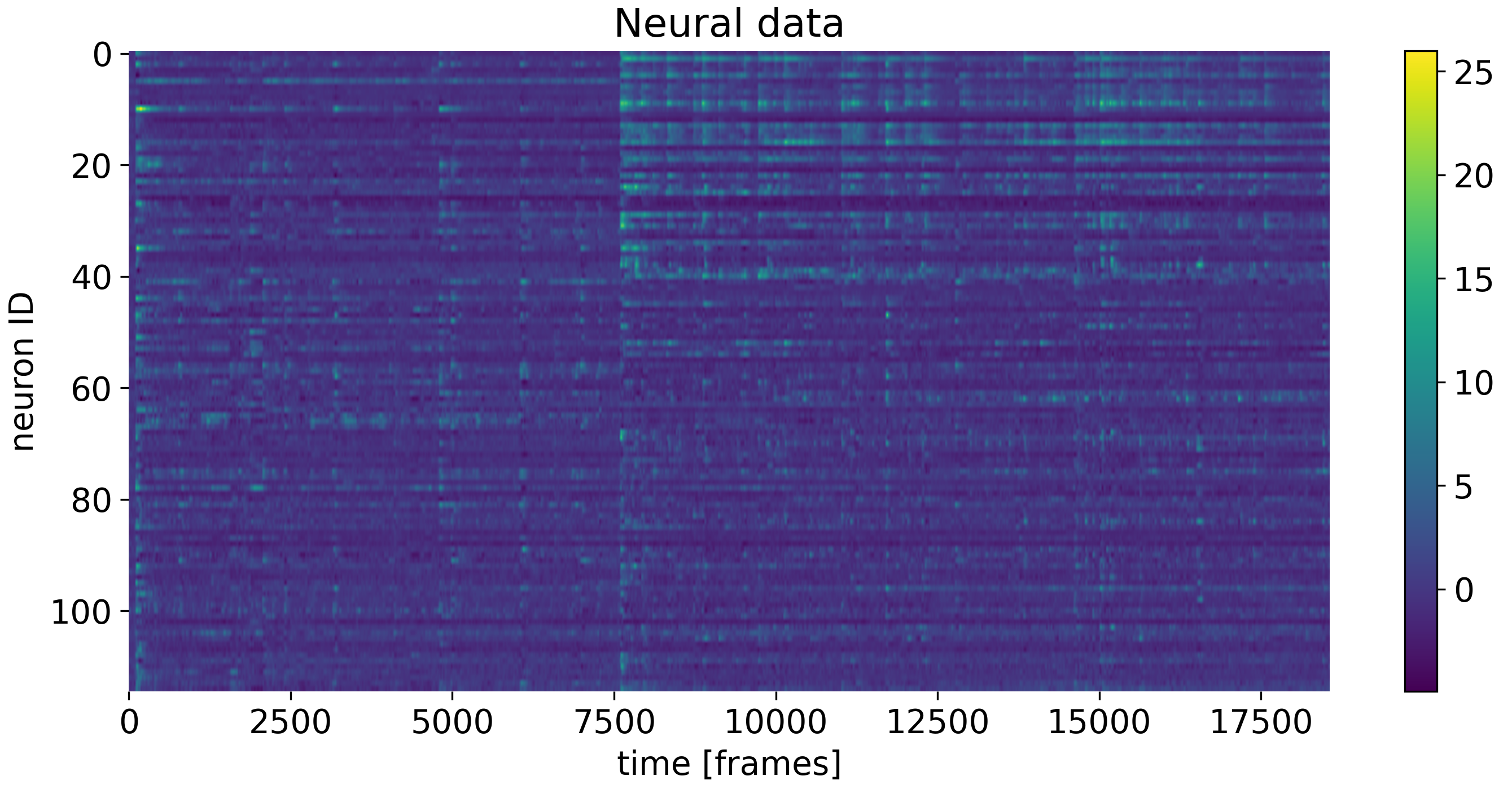 The neural data used in the exercise. Shown are the responses of neurons to different social stimuli.
