Visualizing Occam’s Razor through machine learning
In my previous posts, I shared some thoughts about the intersection of Zen and programming, and Zen and natural sciences. Now, I want to switch gears again and focus on a topic that sits firmly within the realm of data science but, in my opinion, bears a striking semblance to Zen philosophy’s simplicity ethos. I’m talking about Occam’s Razor, and we’re going to see how it manifests in the context of machine learning.
Occam’s Razor
Occam’s Razor is a principle from philosophy that suggests the simplest explanation, given all the facts, is often the correct one. Although it originally stems from the field of philosophical inquiry, it has found profound relevance in the world of machine learning and data analysis, where the dictum is often restated as: “Among models that perform similarly well, the simplest model is preferred.”
So, how can we visualize this concept? While Occam’s Razor isn’t a mathematical or visual concept that we can directly plot, we can interpret it in terms of model complexity in machine learning. The idea is that a model’s performance is tested on unseen data to determine if a more straightforward model generalizes better to new data.
Let’s dive into a simple example using Python, where we’re going to train polynomial regression models of varying complexity on the same dataset and then compare their performance on unseen data.
import numpy as np
import matplotlib.pyplot as plt
from sklearn.pipeline import make_pipeline
from sklearn.preprocessing import PolynomialFeatures
from sklearn.linear_model import LinearRegression
from sklearn.model_selection import train_test_split
from sklearn.metrics import mean_squared_error

# create some synthetic data:
np.random.seed(0)
n_samples = 30
degrees = [1, 4, 14]
X = np.sort(np.random.rand(n_samples))
y = np.sin(2 * np.pi * X) + np.random.randn(n_samples) * 0.1
X = X[:, np.newaxis]

# train/test split:
X_train, X_test, y_train, y_test = train_test_split(X, y, test_size=0.4, random_state=0)

# plot the results:
plt.figure(figsize=(14, 5.4))
for i in range(len(degrees)):
    ax = plt.subplot(1, len(degrees), i + 1)
    plt.setp(ax, xticks=(), yticks=())

    polynomial_features = PolynomialFeatures(degree=degrees[i], include_bias=False)
    linear_regression = LinearRegression()
    pipeline = make_pipeline(polynomial_features, linear_regression)
    pipeline.fit(X_train, y_train)

    # Evaluate the models using cross-validation
    scores = mean_squared_error(y_test, pipeline.predict(X_test))

    X_test_plot = np.linspace(0, 1, 100)
    plt.plot(X_test_plot, pipeline.predict(X_test_plot[:, np.newaxis]), label="Model",
             color="#E69F00", lw=3)
    plt.scatter(X_train, y_train, edgecolor='b', s=40, label="Samples")
    #plt.xlabel("x")
    #plt.ylabel("y")
    plt.xlim((0, 1))
    plt.ylim((-2, 2))
    ax.spines['top'].set_linewidth(2)
    ax.spines['bottom'].set_linewidth(2)
    ax.spines['left'].set_linewidth(2)
    ax.spines['right'].set_linewidth(2)
    plt.legend(loc="best", fontsize=16)
    plt.title(f"Fitted polynomial degree: {degrees[i]}\nMSE = {scores:.2e}", fontsize=20)
plt.tight_layout()
plt.savefig("polynomial_regression.png", dpi=300)
plt.show()
In this code, we’re generating a synthetic dataset and dividing it into a training set and a test set. We then fit polynomial models of different degrees to the training data and evaluate their Mean Squared Error (MSE) on the test set.
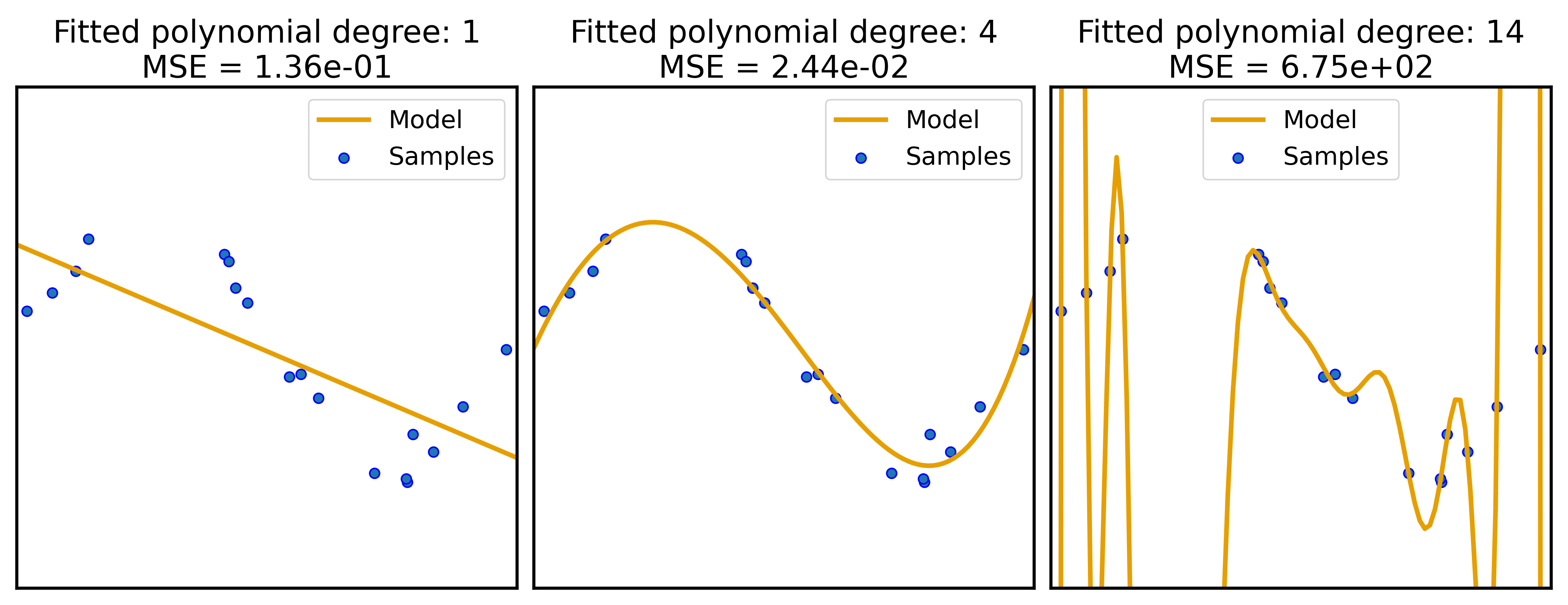 Results of polynomial regression models of varying complexity on the same dataset. The MSEs on the test set are shown in the title of each subplot. While model 1 (left) is too simple to capture the underlying structure of the data, model 3 (right) is too complex and overfits the data. Model 2 (middle) is the best compromise between simplicity and performance.
The plots produced show the fitted models and their MSEs on the test set. In line with the principle of Occam’s Razor, we’ll typically observe that a model of intermediate complexity performs best on the test set. This showcases that, among models that perform similarly well, the simplest model (the one with the lowest degree that still performs well) is preferred.
Conclusion
The practice of visualizing Occam’s Razor in this way brings home the essence of the principle in a tangible manner, illuminating the wisdom of simplicity, a virtue extolled in both Zen philosophy and effective data science practice.
Feel free to leave a comment below if you have any questions or feedback. Or reach me on Mastodonꜛ.





comments